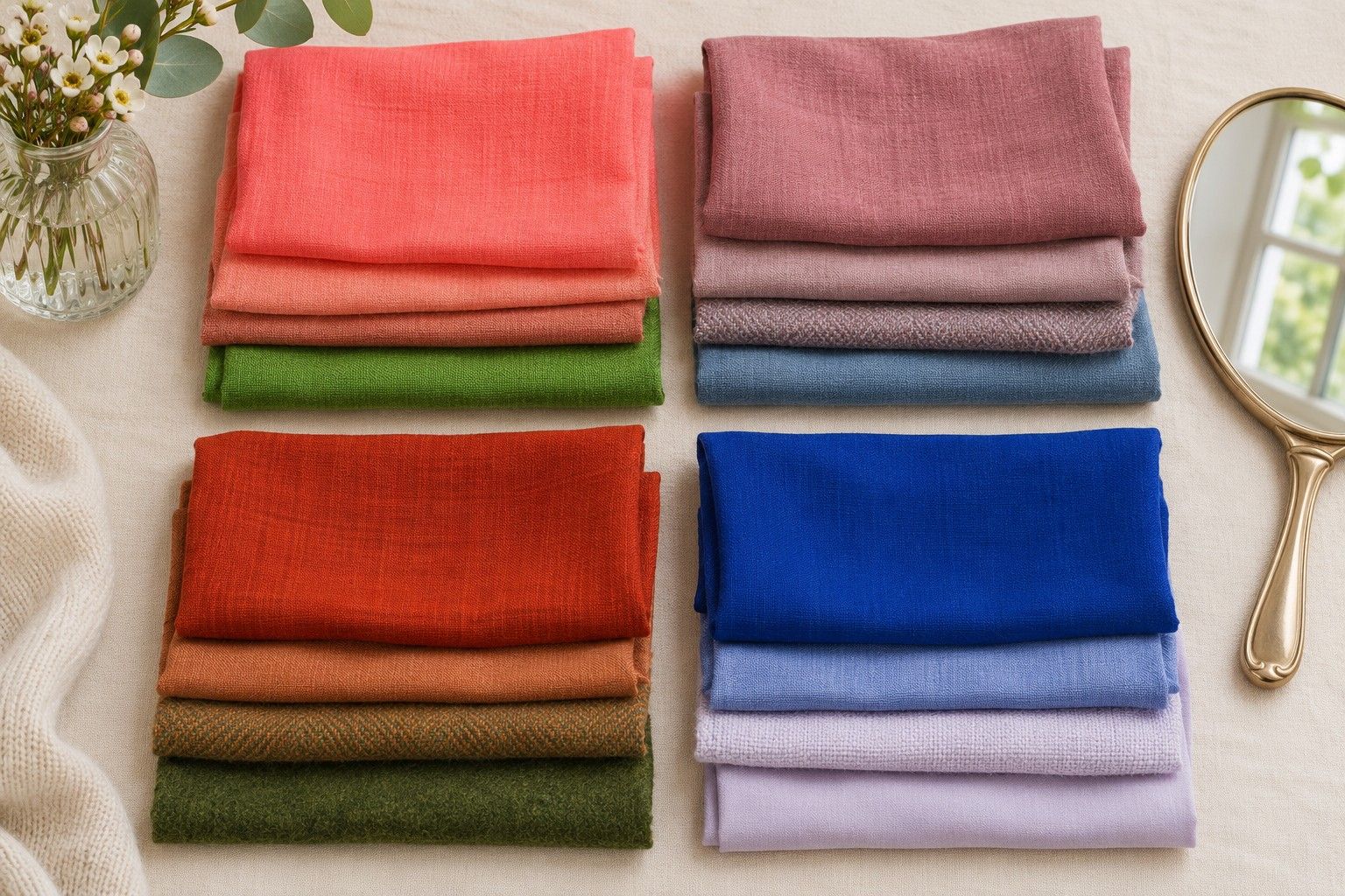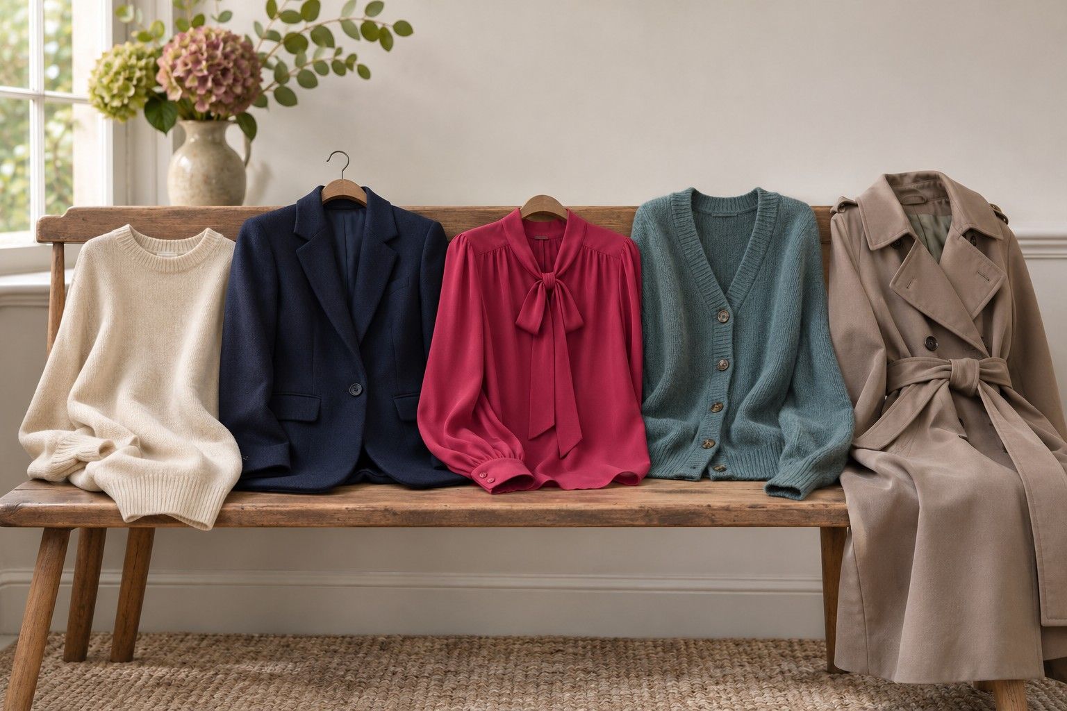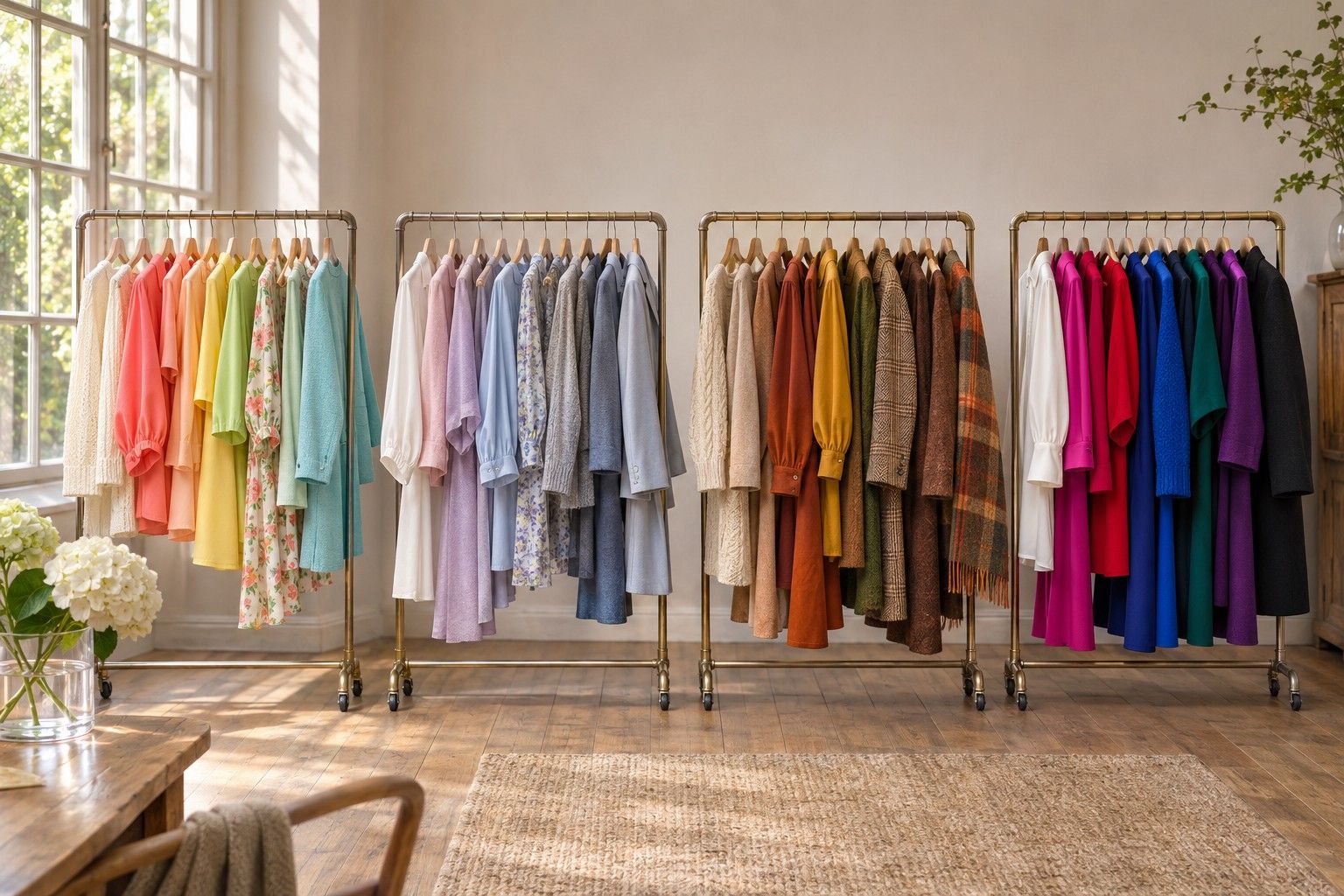
The quickest way to answer ‘What colour season am I?’ is to find which two sets of clothes you might plausibly wear, then look for the difference between them. The four season families give you a small set of comparisons. Start with a few things already in your wardrobe, check how they behave against your face and use the closest pair as your next test.
Spot the first signal in clothes you already use
Think about three things that make it out of the wardrobe most weeks. Separate the clothes you pick for fit or warmth from the colours you like looking at near your face. A charcoal coat might earn its place because it fits over a heavy jumper. A grey-blue T-shirt you keep reaching for under that coat is a better hint about colour. Add one piece you love on a hanger and rarely wear next to your face.
Lay them together by a window. What is the clearest difference you see between the pieces you wear and the one you put back? A cool blue shirt and a cool blue jumper might both work while your yellow-green cardigan looks out of place. That is a reason to test temperature first. A clear blue or green and a greyed shade may feel much further apart to you than the difference between warm and cool reds. In that case, look at clarity before you worry about undertones.
Consider how dark your favourite colours are relative to one another. In a drawer of neutral T-shirts, a soft white, a medium grey and a dense charcoal can cover a wide range of depth even if the temperature difference is small. Hold your favourite by the neckline, then try the nearest lighter and darker version. If you prefer a consistent depth range across more than one hue, keep that information on your shortlist. You can still compare the season families when your warm and cool results are mixed.
Make comparisons where your skin is evenly lit. Move away from a sunbeam or a lamp with a yellow bulb, and look at the same part of your face each time. In a temperature comparison, pick one spot such as the edge of the chin or the skin either side of the mouth. For clarity, look at whether you see your features easily from a step back. Change the fabrics a few times and see whether the same effect keeps catching your eye.
Separate Spring from Autumn if warm colours stand out
Spring and Autumn share a tendency towards warmth. The useful question is how much clarity and depth you want with it. Spring colours tend to look cleaner and lighter. Autumn colours tend to look more grounded, with a stronger earth or brown note. Some versions of Spring have quite rich colours and some Autumn palettes have light beiges, so compare equivalent shades before choosing between them.
Try two warm greens: a clear leaf green and a quieter moss green. You may need to compare a medium moss against a medium leaf green and save the darkest olive for later. Go back to the one that worked and add a red of similar clarity. Someone drawn to the clean leaf green could compare a warm coral against a muted warm salmon. If both greens look good and you see a bigger change with the reds, give the reds more weight.
Warm cream can make a pleasant neutral for either family. For a closer test, keep a piece of cream cloth at the neckline and place an accent below it. A clear yellow-green has a different effect against cream from a greyed olive even if both accents share a warm direction. Try the combination again with a deeper neutral such as caramel or tobacco brown. Which pairing can you see yourself wearing across an entire outfit, and which starts to steal attention from your face?
If the warm, clear pairs hold up and you still like a lighter neckline, Spring is the more useful wardrobe to explore first. If softer greens and terracotta win, try adding a mid-depth Autumn neutral. A light camel may serve your everyday outfits better than the deepest chocolate even if the Autumn direction is clear.
Separate Summer from Winter if cool colours stand out
Summer and Winter both contain cool blues, reds and neutrals. Their difference is easier to see if you put two blues of similar depth on the table. One may look softened with grey, the other distinctly clean. This matters because a pale dusty blue against a near-black blue changes two variables at once. Find a medium slate blue and a medium clean blue, or a soft cool raspberry and a clearer cool raspberry.
Try pairing each top with the same dark jeans or dark skirt. Summer may look more comfortable when the colours connect gently, as with dusty blue and a mid navy. Winter may look stronger when the pieces have a crisp distinction, as with clear cool blue against an almost-black navy. Keep both outfits within the depths you already wear. You can build an effective comparison with a mid-tone and a dark tone even if optic white looks like too much.
Next, separate clarity from contrast. A bright cool pink worn under a grey jacket can be fairly vivid while creating little light-dark contrast. A pale grey shirt under dark charcoal has much more light-dark contrast even though both shades are muted. If clear pink makes a good accent but the pale grey and charcoal feel closer to your usual outfit, record the two observations separately. Your season is a broad guide to colour choice and your best contrast level tells you how to combine those colours.
A cool muted result gives you a good reason to start with Summer, including its medium and deep shades. A clear cool result with a liking for crisp pairings is a reason to take a look at Winter. When you suspect both, test colour at a similar depth twice before drawing a line through either wardrobe.
Compare your two closest families with a shared starting colour
If you are between Summer and Autumn, begin with softness and move temperature gradually. A powdery cool pink and a warm soft rose can answer more than a cool pink and a strong rust. If you are between Autumn and Winter, start from depth and compare a deep warm brown against a deep cool brown. Choosing two pairs that differ in small ways helps reveal a pattern. An isolated winner might come down to that one garment's finish or cut.
If you are between Winter and Spring, you may prefer clarity irrespective of temperature. Test similar samples of coral red and clear raspberry near the face. Give the samples an honest chance by looking at them on the table first. A dusty berry against a clear coral would make Spring look convincing before the temperature test even started. For a Spring and Summer comparison, start with two relatively light blues or greens and see whether you prefer the warmer cleaner one or the cooler softer one. Follow up with a comparison that changes warmth alone.
Keep a working answer with one example from each side. ‘Summer leaning Autumn’ could mean slate blue is your most reliable neutral, with a soft warm rose still worth taking seriously. Once you know what each of those colours does for you, try a garment in your preferred category the next time you shop. Bring a fabric you already get on with, or choose a shop with daylight near the entrance so that you can compare one shade with another after seeing it under the shop lighting.
If you rarely see a difference between the same pairs on two separate days, list the clothes that do work. A hand-sized group of successful colours tells you where to spend your attention. Broad families make the first search easier. A personal colour palette gets more precise as you learn how those shades behave across the coats, tops, accessories and lights in your own week.