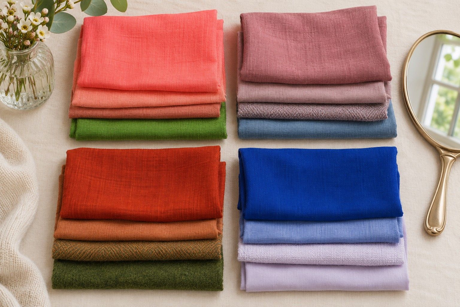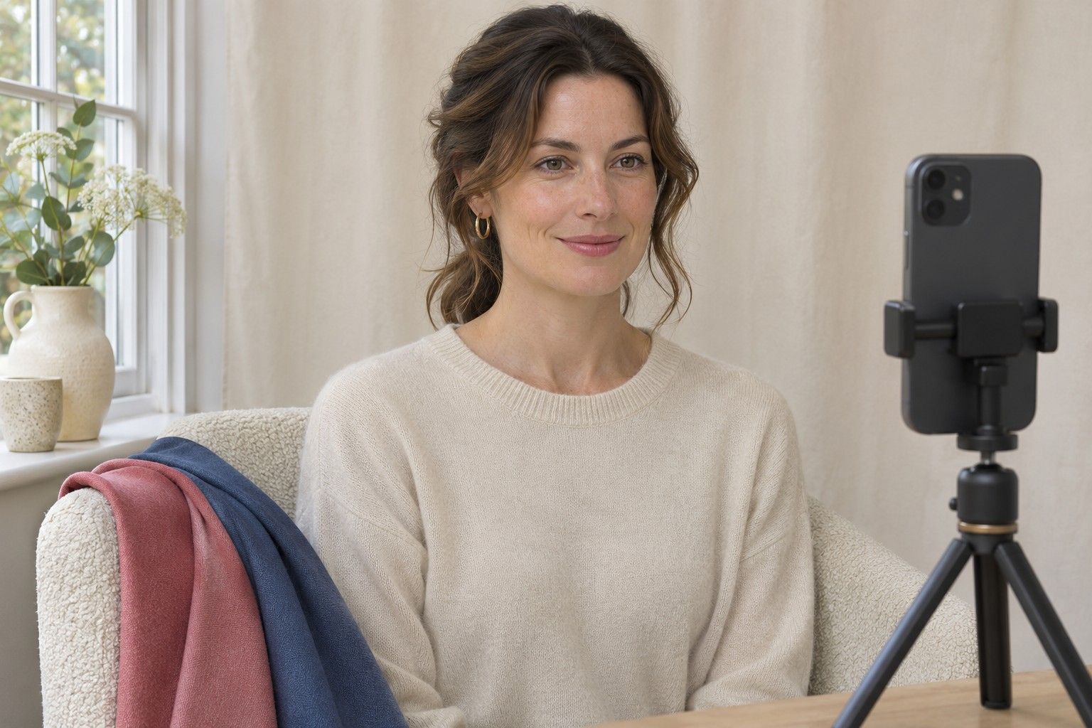
A colour analysis photo test is most useful when you can put two pictures side by side and know which part of the scene changed. A cool shirt photographed at noon and a warm shirt under the kitchen lights might give different results even when the colours suit you equally well. Take your own small set of comparison photos in one spot, then use the mirror to check the differences you noticed on screen.
Choose daylight you can repeat
Pick a window where you can face the light without standing in direct sun. The clearest place is often a step or two back from the window. Hold a white towel in front of your chest. If it appears bright on one side and dark on the other, turn square to the window or move until the light is more even. A sun patch moving up the wall, a blue curtain or a bright awning outside can all change the colour of the light. Try an ordinary room with pale walls and switch off any lamps. If clouds are moving quickly, wait a few minutes for the brightness to settle before taking a complete set.
Arrange a plain chair or mark a spot on the floor so you can return to the same distance. Place the phone at eye height on a stable surface, with the camera pointing straight at your face. Avoid filling the frame from very close range. Leave room above your head and enough below your chin to show the cloth you will compare. A high angle gives you different shadows around the eyes and chin from a straight-on view. If you use a friend or a timer to take the photos, check the camera position after the first shot and leave it there.
Keep what is already on you consistent. Remove tinted products if you want to see how the fabrics look with bare skin. If you usually wear a strong lipstick or coloured glasses and want to include them in your wardrobe choices, run that as a separate comparison with the same makeup or frames in every shot. A strongly coloured top can reflect light near the face, so cover it with a plain layer before you start and hold every comparison cloth at the same height. If dyed hair takes up much of the frame, clip it back consistently for the first round. You can run another round with hair down to judge the colours you will wear with your current haircut.
Keep the camera settings stable
Use the same camera, lens and mode for every photo. The main rear camera on a phone can be easier to position on a stand. A front camera also works when it lets you frame yourself reliably. Look for any colour filters and skin-smoothing options in the app and switch them off where possible. Stay in ordinary photo mode so the camera keeps the fabric and the face in the same frame. Portrait processing can blur fabric edges, which makes it harder to compare the point where the cloth meets the skin.
Some camera apps let you lock focus and exposure by pressing on the face or selecting a manual setting. Use that feature if available and check that it stays active when you take the next photo. If your camera offers manual white balance, keep it fixed for the whole pair. A shot recorded under a different automatic white balance can appear warmer or cooler even when you took it seconds later. When your app makes these decisions automatically, keep the amount of cloth in view similar and check for changes on the wall behind you before trusting the comparison.
Start with one neutral reference photo. You can leave a small piece of matte grey card visible in the corner of each shot, beyond the area you will assess. It gives you a quick way to spot a change across the frame. If the same card is pale in one image and charcoal in the next, the brightness or exposure changed. If it looks pinkish in one and greenish in another, check whether the light or automatic colour processing shifted. Use the card as a warning that the pair needs a redo. A neutral card in the frame does not turn a phone into a colour measuring instrument.
Check how the fabrics change exposure
Begin with two matte cloths at a similar depth. If you are comparing warm and cool, a softly coloured coral and rose can be a better pair than orange and black. Hold the first fabric across the same width of shoulder you plan to cover with the second, take the shot, and switch within a few seconds. Then photograph the same pair in reverse order. Match the size of the exposed fabric as closely as you can. A white towel taking up half the frame gives the camera a different scene from a narrow strip of white peeking out at the neck.
Compare the two pictures using the same screen with a steady brightness. Turn off night colour adjustments while you look. Begin with the background. If it darkens along with the eyes and cheeks in only one picture, the camera may have adjusted the whole frame. If the background and grey card look similar but the colour under the chin shifts with the fabric, you may be seeing reflected light. A shiny pink scarf can bounce a pink cast upwards, especially when it sits close to the jaw. Try a matte pink of similar depth or drop both drapes slightly and shoot again to see whether the effect continues.
Separate the light-versus-dark comparison from the warmer-versus-cooler one. For a depth test, a pale slate and a deep blue-grey give the camera a deliberate change in brightness. That makes checking the background and reference especially important. Compare what happens to the boundary of the jaw and whether shadows around the mouth or eyes get stronger. You can also try a dusty blue and a clearer blue of similar depth to look at saturation. Write down which difference survived two rounds. If the camera keeps brightening the darker set, use the mirror as your main check for that pair.
Repeat the test and interpret the result
Take a second set on another day, with the same type of light and the same pairs. Give each photo a simple name such as rose 1 or coral 2 before opening them for comparison. Keep the files in capture order so you can spot when a cloud passed or a lamp went on. A preference that repeats across both sets gives you more to work with than a single strong-looking frame. If the difference disappears as soon as you change the source of light, keep both colours on the list until you have compared them in more than one outfit.
If you want to upload a photo to a free colour analysis tool, check which images it requests and what it says about saving or deleting uploads. A clear, unedited reference image can be enough for a tool that asks for a single portrait. Keep your fabric comparisons for judging the suggested palette at home. Some services use extra colour categories such as Soft Winter and others group nearby colours under a broader season. Compare the actual suggested shades before deciding two tools disagree. Look for matching properties such as cool, deep or soft and take three suggested colours to the mirror.
End with a short record you can use when you get dressed. You might write that cool rose usually worked beside your face, two dark greys were too close to call, and a clear blue had a stronger effect than the dusty one in your usual light. A result at that level is practical even when you have no final season name. Next time you pick a jumper or a scarf, compare it with a garment that already passed your daylight test. Let the way the two pieces look together in person guide the decision.