If you like the softness of Summer colours but a powder-blue jumper feels too pale, try moving towards the dark end of the palette. A Deep Summer colour palette gives you a place to compare smoky navy, blue-grey and muted plum. Start with colours you can hold beside your face and look for a deeper shade that still works when you wear it across the whole neckline.
Find out what your chart means by Deep Summer
Deep Summer and Dark Summer are terms you may see in expanded seasonal colour systems. A chart that divides Summer into Light, Cool and Soft may still include deep smoky blues and plums within those groups. Read the labels alongside the swatches. Some charts using Deep Summer emphasise a stronger dark neutral, while others begin with an especially soft range and take it deeper. The label gives you a direction for testing, with the chart itself showing how cool and muted that direction is.
Choose four pieces you can view in daylight. Find a medium slate, a deep smoky navy, a greyed plum and the nearest clean, dark blue you own. The slate gives you a point of comparison for depth. The two blue fabrics can help you judge clarity if they are similar in darkness. The plum checks whether the same preference holds away from blue. If your fabrics are all different from one another in several ways, choose a single pair for today and fill in the missing comparison when you have better matches.
Pick up the same knit in two shades if you have a chance in a shop. Compare the mediums and darks by laying the cuff of each against the same garment you wore in. A deep navy often looks black in the shop corner and visibly blue beside a window. If you shop online, write down the colour and finish of an actual garment you own and compare deliveries to that. A pale patch on a product image can come from the light bouncing off the fabric, especially on a textured weave. Look for colour across a broad, evenly lit area.
Compare navy and charcoal in two practical outfits
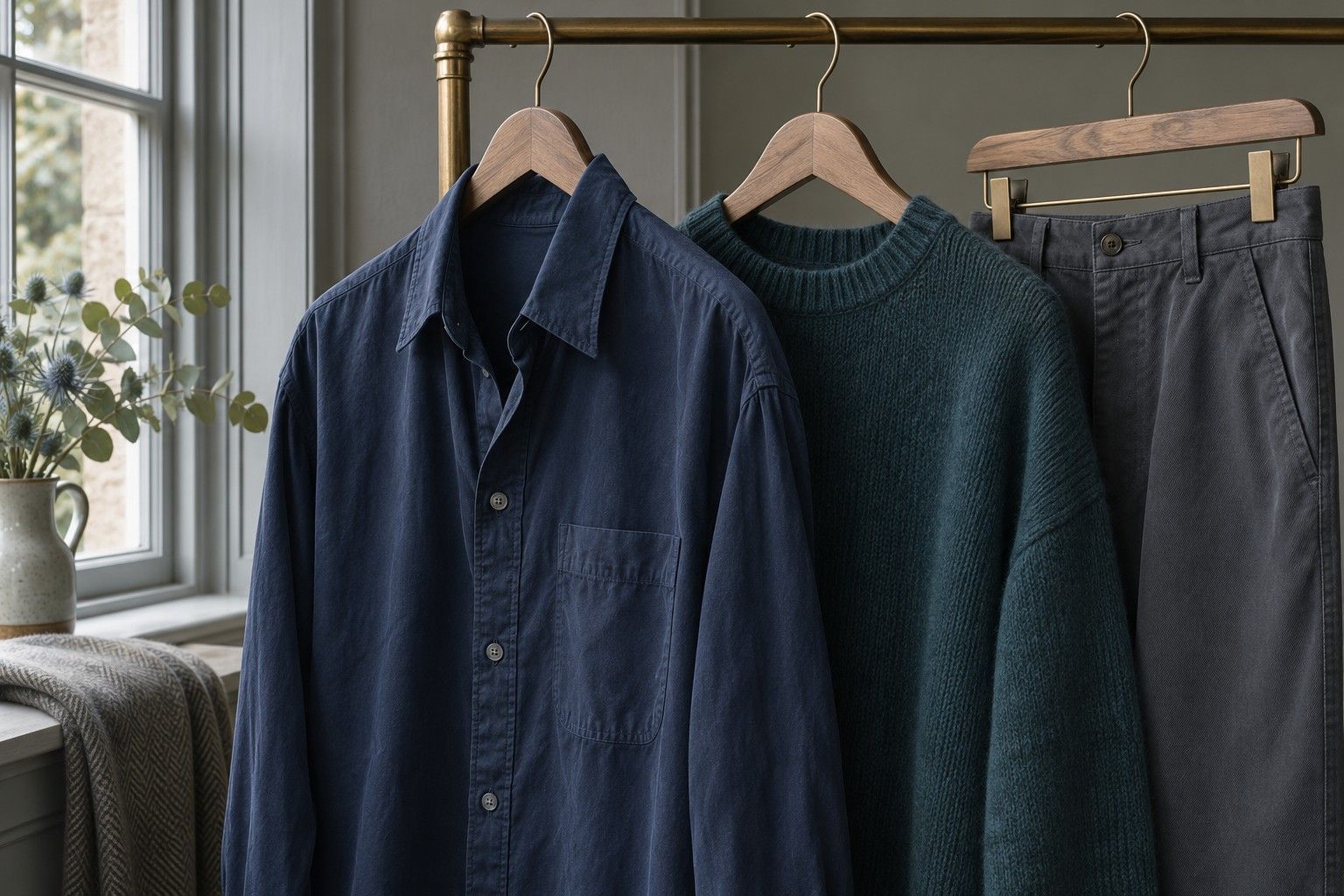
Use a deep smoky navy and a charcoal with similar depth. Put them one at a time beside a soft, cool pink or muted lavender top. First try each as it would appear in a coat, with a large area beside the face. Open the layer a little more and look again. Navy can keep a connection with the colours in a blue or purple top. Charcoal can give the top its own space. When a fabric pulls brown in daylight, compare it with a bluer charcoal before giving up on the whole colour group.
Next try each neutral as trousers or a skirt with a muted top and whatever shoes you wear most. The seam between a deep navy trouser and a slate shirt can look subtle even if each piece reads clearly as a separate colour. Charcoal with the same shirt might make a stronger line at the waist. Look in a full-length mirror. If the transition feels too abrupt, add a mid-depth belt or wear the top untucked. If the combination already looks balanced, use that same neutral when testing other tops.
Leave both neutrals in your wardrobe if they serve different jobs. For example, a deep navy coat may work with a dusty plum knit and still look at home over a chambray shirt. A charcoal trouser may work on days when you want a different visual weight at the bottom. The quickest way to choose which item to buy first is to count outfits already on your rail that it would complete.
Wear dark colour across the neckline
Put muted plum and inky teal beside one another, then test each at the collarbone. Choose versions with a smoky cast. One way to see it is to compare your teal with a brighter blue-green of similar depth. The smoky shade has less intensity even when both are equally dark. Watch how the fabric and your face look together as you go from a small strip to a full panel. This helps when a colour works as a scarf and still feels heavy in a jumper with a high collar.
Use a softer light shade to open up a dark layer. A pearl-grey shirt can sit under a dark plum cardigan, with enough collar showing to change the balance at the neck. Pale blue-grey can play the same role under a navy knit. If pale colours for full tops still feel lost in your wardrobe, keep one for the edge of a printed scarf or the stripe on a darker shirt. You can get a visible shift between the layers without relying on a large area of pale fabric.
Choose surfaces that make the dark shade easy to read. Brushed wool, washed cotton and matte jersey tend to show the colour differently from satin or a shiny technical fabric. If a dark silk shirt works only in some light, look at exactly where the folds catch light when you move. A dark matte collar may give a steadier effect for everyday wear, while you may enjoy the flashes of light on the silk for an evening outfit. Test each against the coat you will actually wear over it.
Check the border with Winter using equal-depth pairs
Place a dark smoky blue next to a clean dark blue of roughly the same brightness. Hold them in turn at the same height. You may find the clean shade brings a clearer edge to the outfit, or that the smoky blue gives you enough definition and sits more easily alongside your other colours. Avoid the familiar comparison between a powdery mid-blue and a saturated dark navy for this step. Those two change depth and intensity together, and a preference for navy could be entirely about depth.
Use an outfit to test how much contrast you want after you have compared clarity. Put a smoky deep jacket over mid-depth grey and then over a cooler light grey. See whether you prefer the small change or the stronger separation. If clear dark colours work across the whole neckline and you enjoy conspicuous light-dark differences, broader Winter palettes may give you more outfits to try. If smoky colours carry the outfit and the deep-to-medium pairing is usually enough, start with the darker side of Summer and hold onto the few clearer accents you already enjoy.
Write down two dark colours, a lighter layer and one accent from the clothes you compared. Deep navy, charcoal, blue-grey and mulberry make a possible set. If each appears in at least one outfit you can wear comfortably for a few hours, keep that set close to hand when you compare swatches. Your next useful decision may be as small as looking for a blue-toned navy coat with a matte finish. The tested outfit tells you how to recognise it, even if the shop has never heard the term Deep Summer.