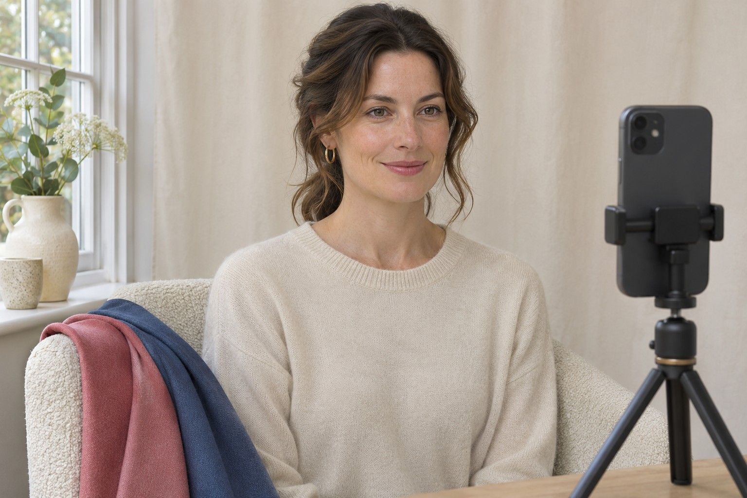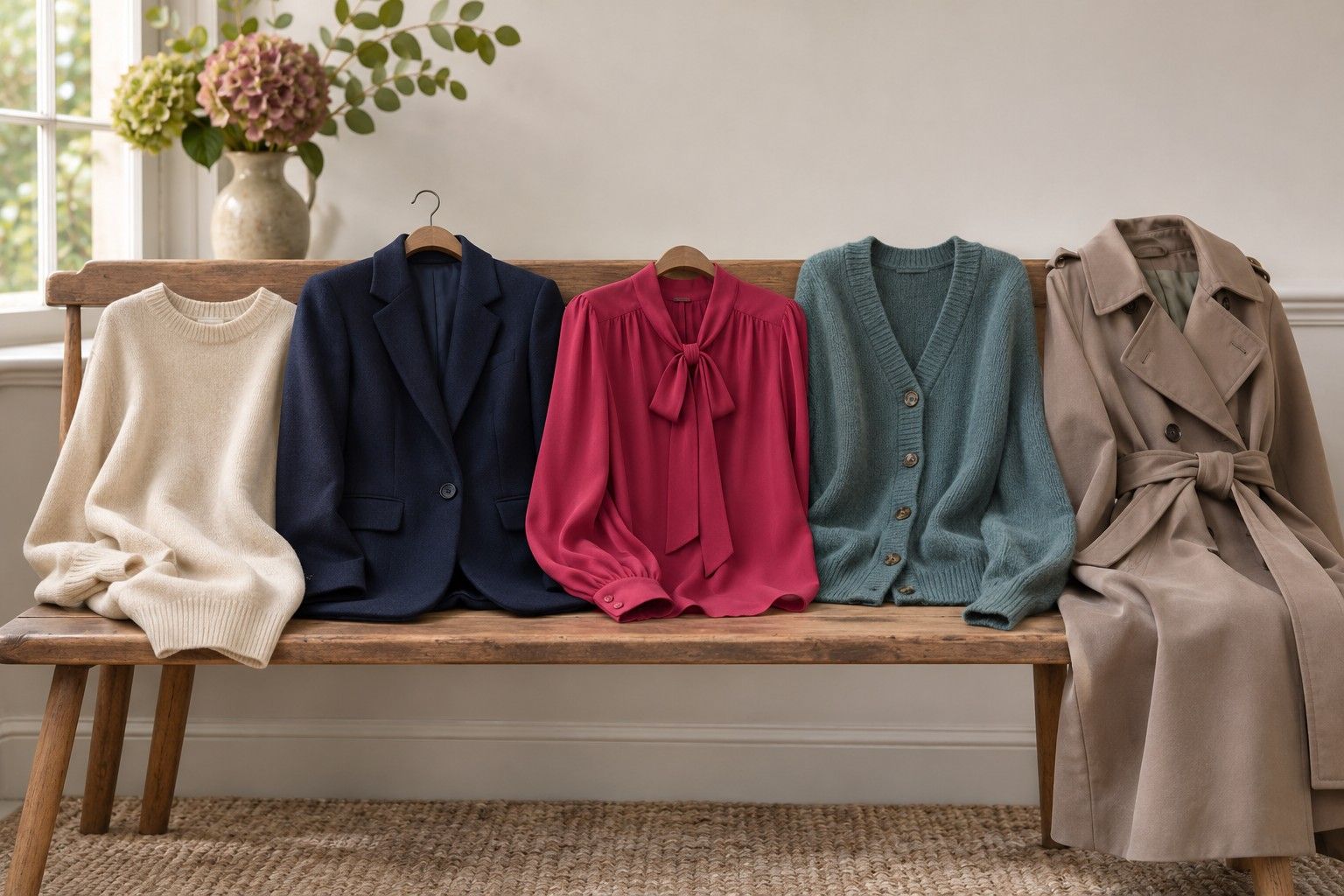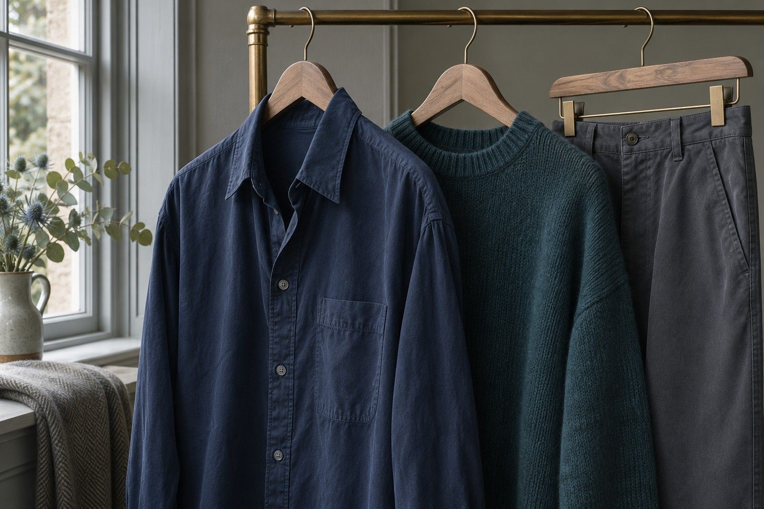
Pull a few tops from the wardrobe and take this free colour analysis quiz in front of a mirror. You will compare warm and cool colours, clear and muted shades, then light and deep ones. Write down what you see after each comparison. Your answers will give you a season to try and a second direction to explore if the scores are close.
Take the fabric-based quiz
Use a mirror next to a window with indirect daylight. Stand facing the window so light reaches both sides of your face. Switch off the overhead light if it makes one side yellow. A plain wall helps, especially if bright wallpaper or a curtain throws colour back onto your skin. Take off strongly coloured glasses or accessories if you can see comfortably without them. If you wear foundation or tinted moisturiser, try the quiz on another day with bare skin or keep a note of what you have on.
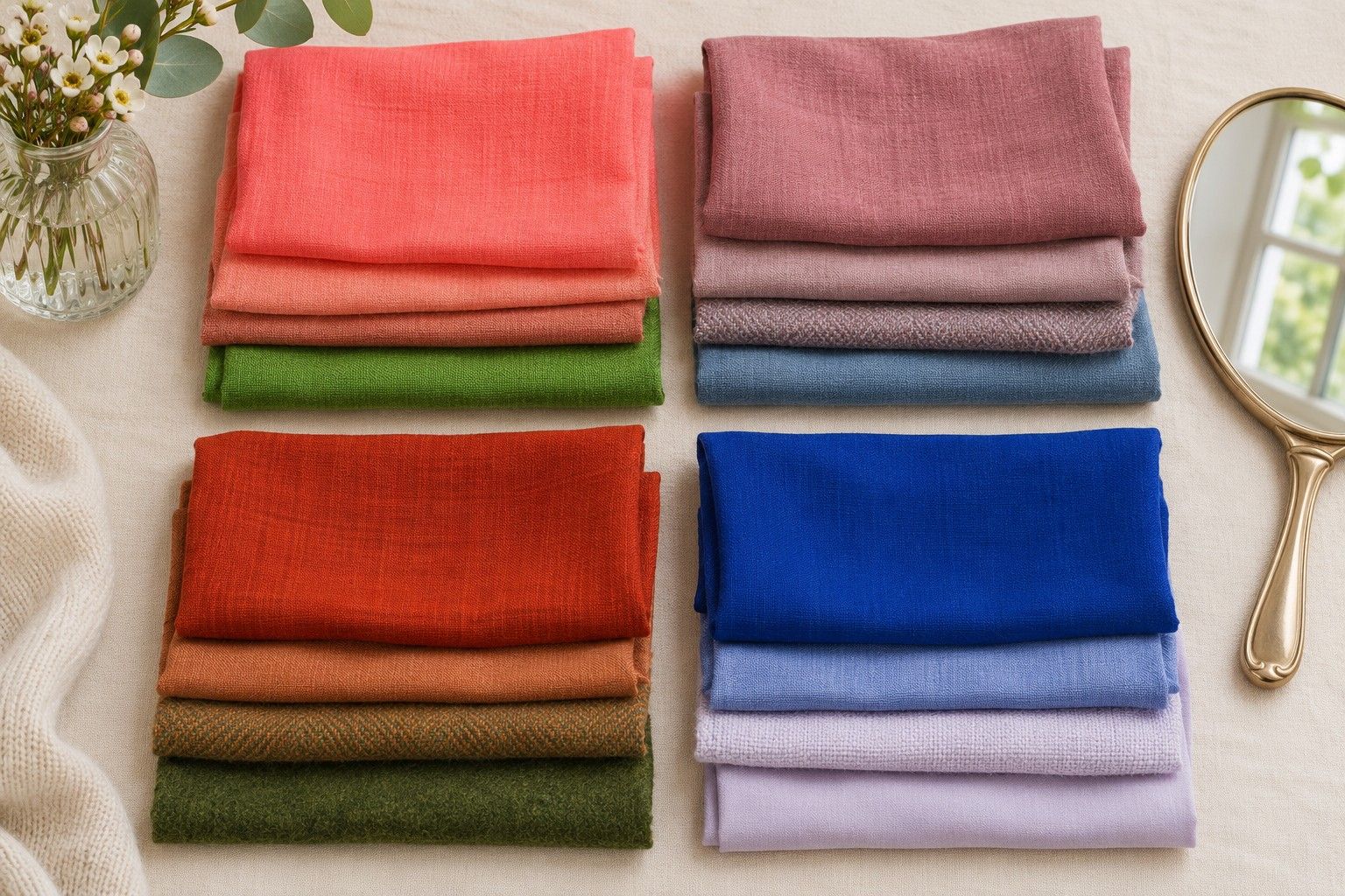
Gather tops, scarves or folded fabric samples. You need a piece big enough to cover the colour of the top you are already wearing. Go for similar fabric finishes within each pair. The sheen of a silk scarf and the shadow on thick wool can change what you are seeing even when the dyes look close. Lay the samples out under the same window before you start. If one looks much darker than the other, it belongs in the depth round.
Temperature, pair one. Hold a muted peach beside your face, then replace it with a dusty pink of similar depth. Look at the area around the mouth and the edge of the jaw. Give the pair a W if peach is the easier colour, a C if pink makes the face easier to read or a dash if you keep changing your mind. Swap back once before you decide.
Temperature, pair two. Try a warm muted brick against a muted berry. If your brick is deep and your berry is pale, find a closer match or skip the round. Give another W for brick or C for berry if one wins clearly. A pair of light warm cream and a cool off-white of comparable depth gives you a third temperature check. A brilliant white can be so much brighter than cream that it answers a different question.
Clarity, pair one. Pick two reds or pinks at about the same temperature. Compare a vivid coral with a softened coral, or a clear raspberry with a smoky raspberry. Write B for a brighter colour if you still notice your face easily, M for muted if the quieter version sits more comfortably or a dash if you cannot tell. A loud colour may appeal to you on its own, so spend a moment looking at your eyes and lips while you make the swap.
Clarity, pair two. Try a clean blue against a greyed blue or a lively green against a subdued green with the same warm or cool direction. Compare the samples on the table first. If the clean blue is closer to navy and the greyed blue is almost pastel, their depths are too far apart. Record one B or M if the colour effect is repeatable. A third pair is helpful if the first two disagree.
Score temperature and clarity
Count the temperature answers separately from the clarity answers. If you recorded two W answers and a dash, your temperature direction is warm. If you recorded one W, one C and a dash, your direction is open. Apply the same rule to the B and M answers. An answer from a pair you would not be able to reproduce tomorrow can stay unscored. You will learn more from two dependable comparisons than from a page of confident guesses.
| Temperature lead | Clarity lead | Season to try first | Fabric to try next |
|---|---|---|---|
| Warm | Bright | Spring | Clear warm coral |
| Warm | Muted | Autumn | Soft rust |
| Cool | Muted | Summer | Greyed rose |
| Cool | Bright | Winter | Clear cool raspberry |
These pairings describe the broad seasonal colour analysis families. They are helpful when both parts of the quiz agree, and especially helpful in telling you which fabric to pull out next. For example, if peach and brick won while the smoky shades beat the clear ones, try soft rust alongside the original muted brick. If rust feels too orange, look for a quieter, less orange terracotta and see whether the muted warmth still works.
A tie can narrow the field in a different way. If muted won twice and temperature stayed even, start by comparing two muted families, Summer and Autumn. Set a greyed rose and a muted warm rose side by side. Keep a close eye on depth. Some warm roses are fairly dark, so their nearest cool counterpart may be a deeper mauve rather than pale pink. A clear tie matched with a cool temperature result points to Summer and Winter for the next round.
Use depth as a tie-breaker
Choose a light, a medium and a dark shade within the temperature and clarity you liked most. For cool muted results, try a pale dusty blue, a mid slate blue and a similarly softened dark navy. Get as close as you can to one hue. Compare the pale and medium fabrics first, put them down, then compare the medium and dark ones. The medium sample makes it easier to see whether dark feels distinctly better or whether the pale option was simply an especially poor match.
Observe what happens as the fabric changes. A light sample can make the transition from jaw to neckline look gentle. A dark fabric can give the face a clearer outline or make the neck area look heavy. Write down the effect in your own words. If your eye jumps to the fabric each time you put on navy, try medium slate and a slightly lighter navy. An extreme contrast can mask the useful range between the two.
Keep depth results in proportion. When the temperature and clarity votes point firmly to Summer, a good result in deep navy gives you somewhere to start inside the Summer range. It takes repeated wins from clearer cool colours to make Winter the better working explanation. Likewise, someone starting from Autumn can like a lighter warm camel as much as dark olive. The depth comparison helps with choosing actual clothes even when the season itself stays the same.
Validate your provisional season
Pick one neutral and one accent from the season that led. Pull out a comparable neutral and accent from your runner-up. For a Summer and Winter comparison, a greyed blue and a clear blue of similar depth make a better first pair than pastel lilac and black. Repeat the comparison on another day in the same spot. Start with the other fabric so your eye gets a fresh first impression. Record which colours win again and change one pair if the first test was hard to see.
Put the winning neutral and accent into one ordinary outfit. A slate top under a navy jacket or a rust scarf over a brown coat gives you a neckline you can judge from a few steps back. Check it near the window and once in the light you normally dress for. If you liked the small swatch and the outfit feels overwhelming, reduce the area of that colour or move it away from your face. Bright pink may be easier to use as a fine stripe than as an entire jumper.
End with a practical note you can use when you shop or dress. Write down the effect you want to repeat, such as cool blue with a little grey and enough depth to stand beside dark denim. Add a second line for what you still want to compare. A personal colour palette can start with a few reliable items, and another season can remain useful while the evidence is mixed. Test new colours against the pieces you have already marked as successes.