A warm colour can feel quiet and earthy or clear enough to lift an outfit from across the room. The True Spring colour palette brings warmth together with clarity. To see whether it suits you, compare a few familiar fabrics in daylight. Start with shades you might actually wear, such as warm cream, coral or a green that reminds you of a fresh leaf.
Start with clear warmth
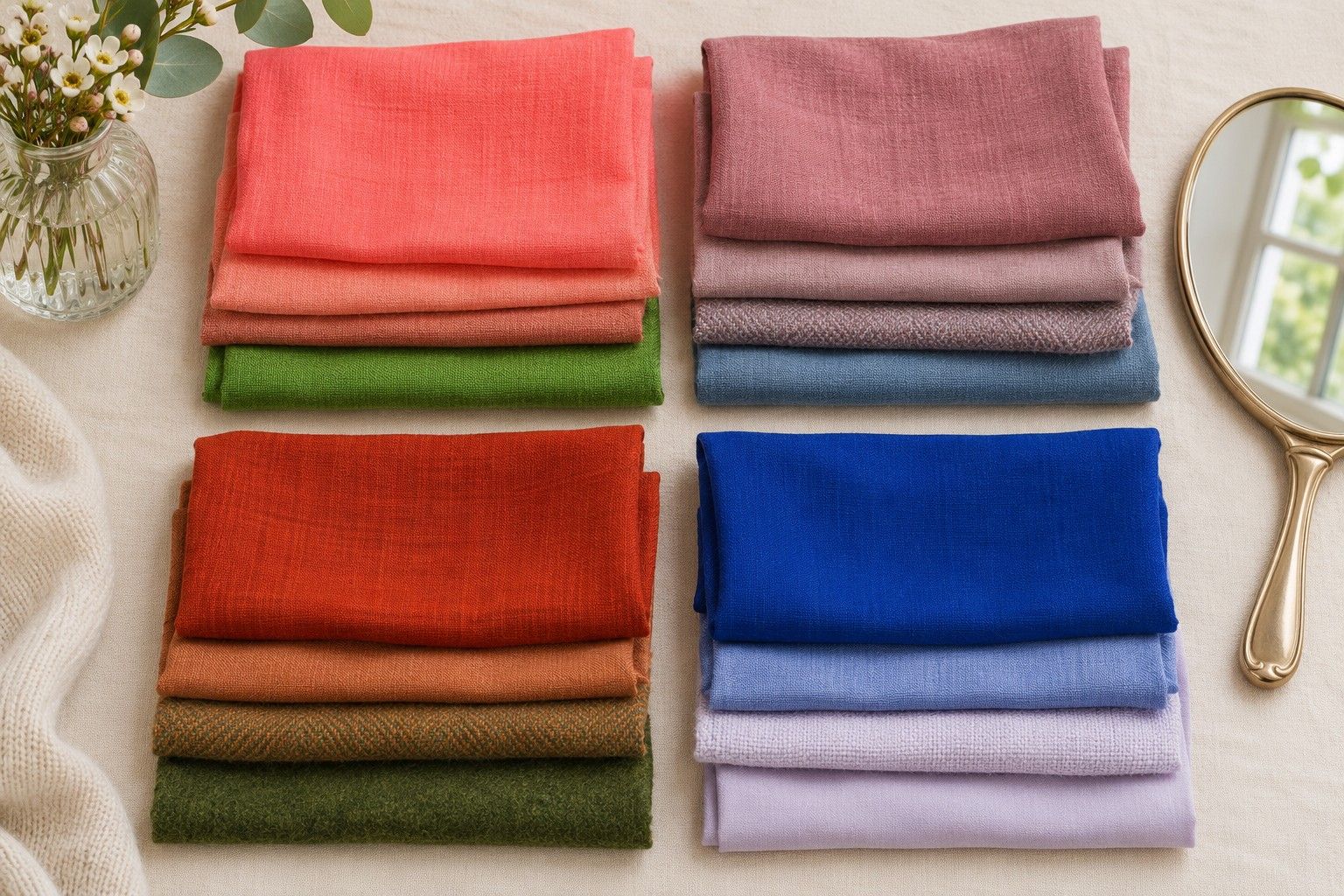
Put a clear warm coral next to a similarly light cool pink. Fold both into equal widths and bring them up to the same point just below your chin. If the coral looks easy to wear and the pink appears icy by comparison, you have a useful warmth clue. Compare a second pair before you give it much weight. Apple green and a cooler green of similar strength can reveal whether your preference holds outside the pinks.
Take a second look at the fabrics on a grey surface. If your coral is significantly darker than your pink, the comparison has changed depth too. Find a closer match or repeat with colours you own at a different depth. Start with matte fabric if possible. A shiny scarf may reflect so much daylight that its warmth becomes difficult to separate from its finish.
Check how the fabrics relate to your face. You might notice that a cooler pink makes the shadow under your mouth more obvious, while your eyes stay easier to see with coral. Use details like those in your notes instead of writing down that one piece made you look better. A concrete description helps you recognise the same effect with a different colour the next morning.
Warmth in this setting is relative to the shades you are comparing. A coral with more rose in it can still come across as warm beside a blue pink. It might look cooler when you put it next to apricot. Keep the fabric that worked for you and bring it to future comparisons. The name on a label rarely tells you where a colour sits between the shades you own.
Compare Spring and Autumn staples
Take a warm clear shade and a warmer-looking earthy version of roughly the same depth. Fresh leaf green and moss can give you a starting comparison if neither is much darker. Try coral and muted cinnamon in the same way. Check which fabric holds its place alongside your eyes and features. If the earthy pieces flatten the combination and the clearer pieces make it feel more balanced, that is a stronger clue for True Spring.
True Spring may also be called Warm Spring. Names are useful within a particular palette system and can shift across charts. Warm Autumn shares ample warmth, with more room for subdued or earthy shades. Look at the fabrics the chart offers near your face. Those tell you more about your shopping options than a debate over the name of your season.
Keep the strongest pair and use it as an outfit comparison. Wear your usual denim and hold the two colours at your neckline in turn. If the Spring colour seems noisy, see whether the actual sample is especially saturated or the denim very dark. Try a smaller area and see whether the relationship improves. Compare the same neckline and amount of fabric again before you conclude that all clear colours are too bright.
Some clothes sit in the overlap and can stay in either wardrobe. Medium warm denim, a clear cinnamon or a quieter yellow-green may work on you even if a chart puts it elsewhere. If you like both halves of the test, keep the colours that work and try a light warm neutral with each. That gives you a stronger basis for everyday dressing than choosing which pile to remove.
Choose three practical light neutrals
Start with warm cream. Compare it with your brightest white under daylight, then put both beside the jacket you wear the most. Cream can give clearer warm colours a soft edge without introducing a grey cast. If a heavily yellow cream pulls attention away from your face, try a milder shade closer to ivory. You want room to reach for it frequently rather than only when you are wearing one particular coat.
Choose a warm sand or a lighter camel as the second neutral. It helps if the colour reflects enough light to sit comfortably near the face. Compare it with your warm cream, then add one favourite accent. A coat in a very rich brown camel can make a stronger dark border than a shirt in sandy beige. Test the type of garment you actually need. A swatch you love on a worktop can look different once it covers your shoulders.
For a third option, try a light warm grey, pale stone or a washed warm blue denim that you already wear. See whether it feels quiet enough beside coral and clear green. You may prefer denim as the bridge between two light neutrals and brighter knitwear. If the washed denim has plenty of yellow stitching, check it with a belt or bag that already appears in the combination.
Keep three swatches or photographs under the same natural light, and use them when comparing pieces in a shop. Take the photographs as references for relationships and check the actual fabric near a window. A pale green with a white background in an online listing can easily read warmer on a screen set to a comfortable evening colour mode.
Use saturated colours in small outfits
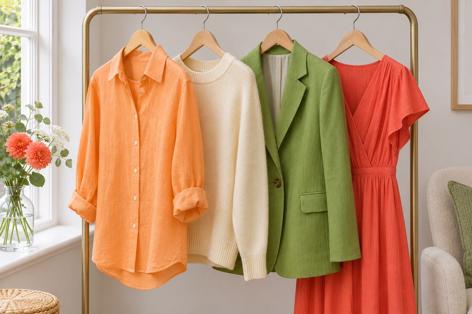
Choose a clear accent and give it one obvious role in an outfit. That may be a coral shirt with cream trousers or a leaf-green scarf on a sand jacket. Check the outfit standing a short distance back from the mirror. At that point, smaller trim and pattern details recede. You can see whether you like where the main colour sits and whether it draws attention up toward your face.
Wear the same accent in two different amounts. A folded scarf can sit next to your collar in a narrow band or cover most of your front when you open it. If the wide version feels strong, try it as a compact knot. You have more room to use other colours underneath. If you like the broad band, look for a top in a similar colour and a finish you wear often.
Try mixing two clear colours through a neutral. A coral top and green bag can work with cream jeans, especially when one accent has less area. Remove the bag and put it back to see what it contributes. If the pairing feels busy, carry the accent further from your face or pick a quieter cut of the same shade. That lets you decide which strong colour you want to lead on a given day.
A useful first purchase might be the item you can wear with three existing neutrals. A clear apricot knit that works with denim, sand trousers and your cream skirt will get more use than a bright dress you can wear with one jacket. Use the successful fabric tests to choose a repeatable combination. When you find a new colour that seems promising, compare it to one of your successful shades in daylight before deciding where it belongs.