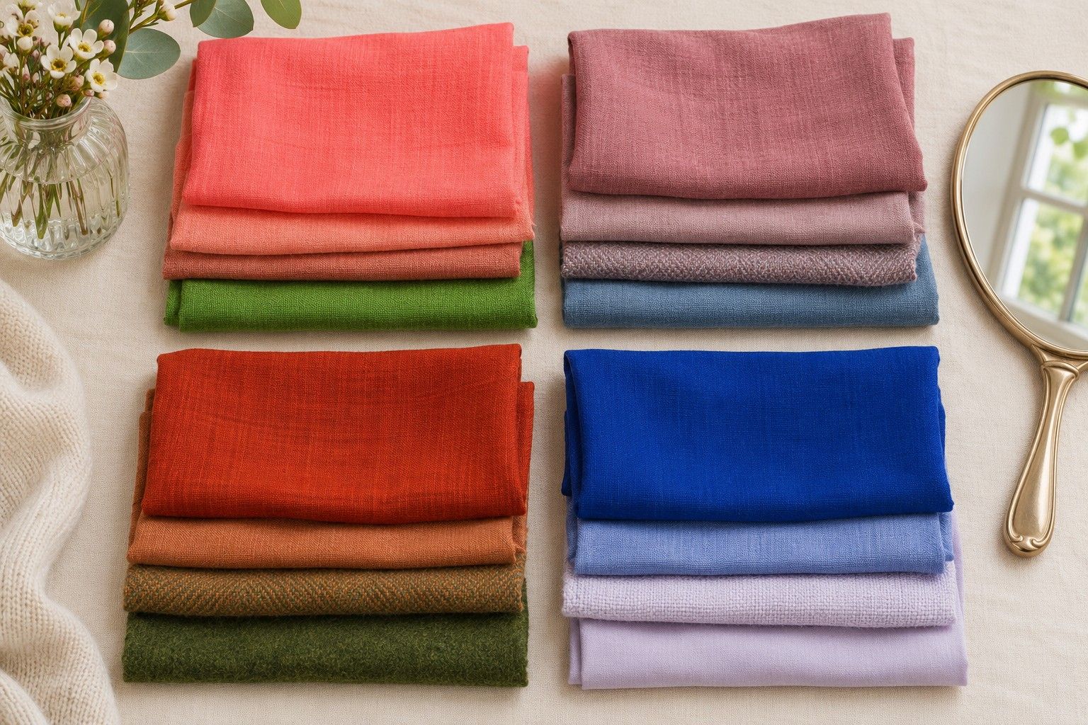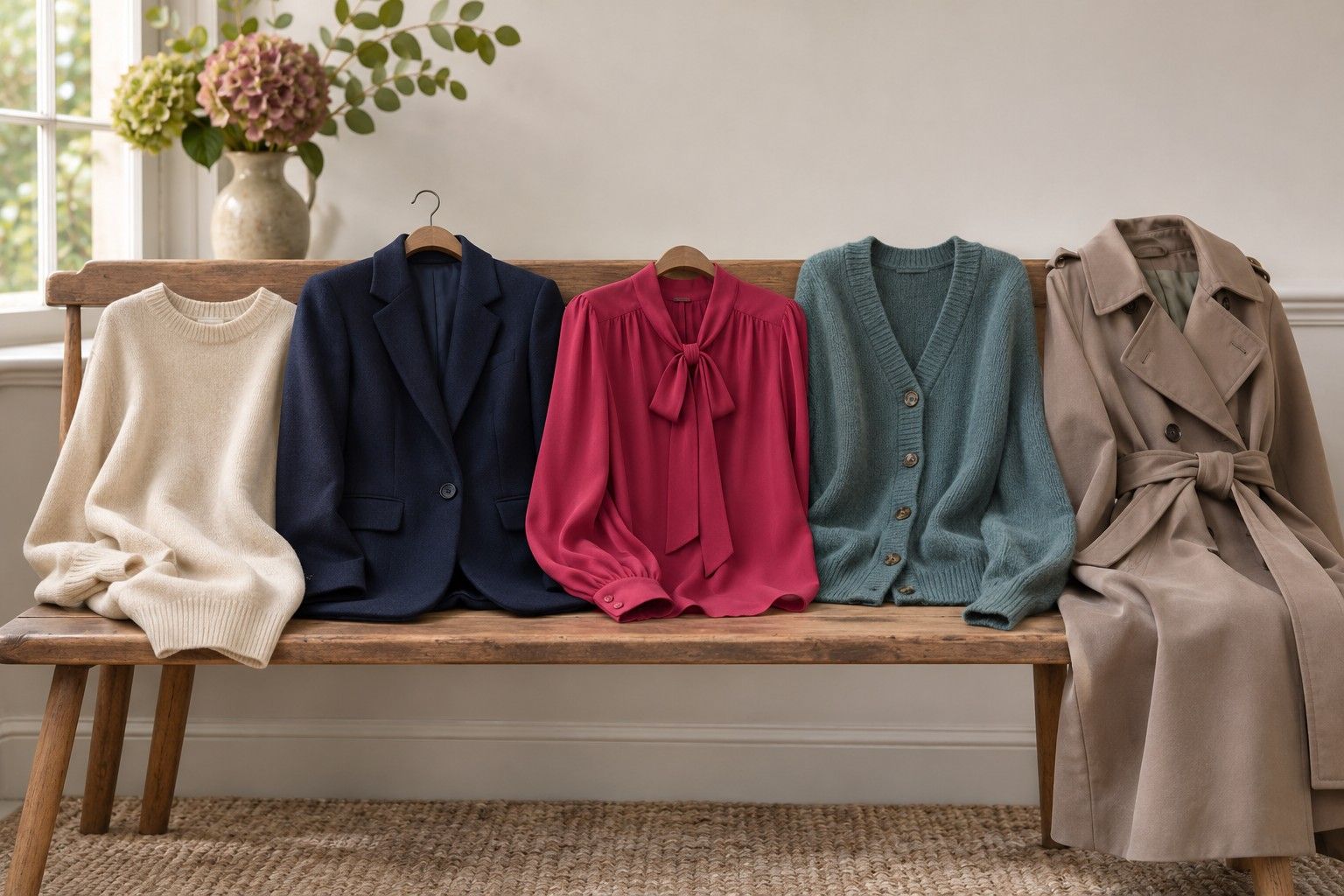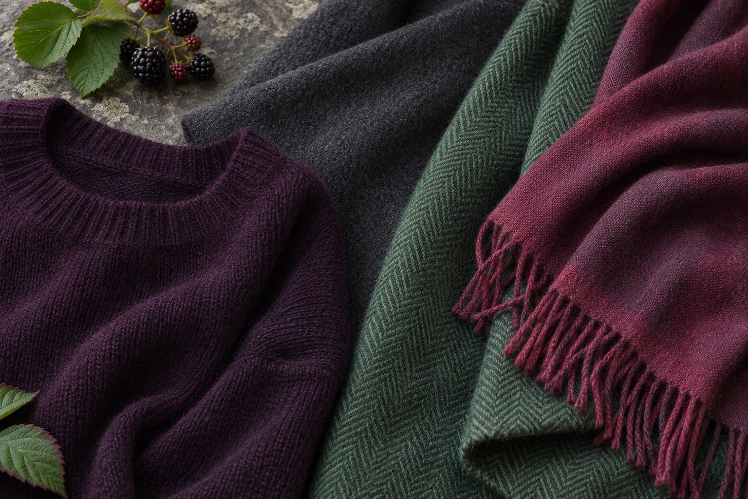
A Soft Winter colour palette often comes up when cool, deep colours feel right and the brightest Winter shades dominate the outfit. Imagine a charcoal jumper you wear happily and a clear raspberry scarf you like in a narrow fold. That difference in how much clarity you want is more informative than whether a chart uses exactly the same label as your quiz result.
Read the Soft Winter label in context
Soft Winter is an optional label in some extended seasonal systems. In a common 12-season arrangement, Winter is divided into Cool, Bright and Deep variants, with names such as True, Clear and Dark used by some guides. If you move from an extended palette to a chart with three Winter groups, you may have to compare swatches yourself to find where the familiar colours land. A system that places Soft Winter close to Summer may offer smoky blues and berry shades. A chart using the same name can lean further into deep, crisper neutrals.
Make a small inventory of the result you received. Write down the three darkest colours, the lightest neutral and the brightest accent. Read them as a group. If the darkest samples include blackened navy and iron grey and the accent is a restrained cranberry, you are looking at a different range from black, optic white and vivid fuchsia. Both can read cool. The amount of difference between the darkest and lightest swatches varies, and so does the amount of clear colour.
Before you make any changes to your wardrobe, choose one colour the chart has in common with a piece you know you like. If the sample is dark wine and you own a burgundy jumper, bring it to the window. A brown-leaning burgundy and a blue-leaning wine can carry the same shop label. Compare them at the collarbone with a plain layer over your current top. The swatch can suggest where to look, and the fabric tells you what you are actually wearing.
Start with dark neutrals that keep their texture
Take charcoal, black and deep navy in fabrics with similar surface finishes. If you only have a black T-shirt and a navy wool coat, fold the coat to show a narrow plain panel and compare it with a thick, matte black fabric if you can find one. A glossy weave catches the window and can give a lighter impression before you have even considered the dye. Check each fabric with your face in the same position. Look at how the dark neckline relates to the hairline, eyes and the folds around the chin.
Charcoal may give you the outline you like in black and reduce the sharp edge under your chin. Ink navy can serve the same purpose if you want a dark neutral with more visible colour. A pair of deep cool greys can also feel quite different side by side. Choose one with a hint of blue or violet and one with a slightly brown cast. If the brown-grey has the same depth and you consistently prefer the bluer grey, coolness may be doing some of the work. If you prefer whichever sample is lighter, record that as a depth clue and repeat the warmth comparison with a closer match.
Use what you learn to decide where you need the replacement neutral. A coat has a large area near your face, especially with a collar turned up. Start with your preferred dark sample for the coat or scarf. Black trousers sit farther from the face and can be useful with the same charcoal and navy layers you already reach for. If you like a defined black edge on a jacket, wear it open over a slate top and check both pieces together. A useful neutral has to work with the rest of the outfit as well as in the mirror test.
Give clearer colours the amount of space they need
Choose a pair of berries, such as a muted cranberry and a clearer raspberry of similar depth. Test each as a small fold at the neck and then as a broad panel across the shoulders. If both are easy to wear as accents but the raspberry takes over as a panel, use the larger area for cranberry. The brighter colour can show through in a scarf print, an earring or a strip of lining at the cuff. If raspberry looks just as comfortable as a full panel, test an equally clear cool blue before settling on how much saturation you prefer.
It is worth testing a light neutral in the same way. Pair a charcoal jacket with a soft cool white and then with a clean, bright white. Fix the jacket in place and show the same amount of each light fabric. For some outfits a cool, lighter grey provides enough separation at the neck. For others a sliver of bright white makes the combination feel more deliberate. Try a folded collar or a white stripe in a knit before deciding that a full white shirt should behave the same way.
Pick one combination you could repeat with two different pieces. Charcoal under a berry accessory is a start. In cooler weather that might be a charcoal jumper with a wine scarf. Indoors it could be a dark grey blazer over a muted plum blouse with a small silver earring. Use a same-depth accent if you want the outfit to read as one group. Add a narrow light detail if the neckline needs a little definition.
Decide how close you are to the Summer border
Start with one outfit you can alter without changing the neckline. Try a dark steel-grey layer over muted rose, then try a medium blue-grey layer in the same fabric weight over the same rose. If you prefer the medium layer even when the darker fabric is equally soft and cool, the softer visual outline often associated with Summer may deserve a closer look. If the deep layer holds the outfit together and the lighter grey pair looks diffuse, depth may be a useful anchor for you. Reverse the order after a short break.
Keep depth steady for the second comparison and vary clarity. Lay a dark, smoky plum and a dark, cleaner berry over the same jacket. A preference for smoke across most pairs points towards building more of the wardrobe around muted colour. If the cleaner berry works in a generous area and you like a distinct light edge against your darkest navy, leave room for the sharper end of the range. This can fit a Soft Winter result whose palette retains some crisp accents. A colour chart alone cannot indicate which proportions you enjoy on a normal day.
Save the strongest results as actual pieces. A short list might contain deep charcoal for jackets, cool grey for T-shirts, muted wine for knits and a small clear berry detail. Someone who prefers lower contrast could keep the same wine and use medium slate for more of the outfit. Write down which dark neutral and which amount of accent worked under your everyday light. That gives you enough information to shop across charts, including ones that use a different name for the cool, muted colours you want.