Soft Summer and Soft Autumn both make room for colours that look faded, smoky or gently earthy. The difference becomes easier to see when you compare the cool and warm versions of a colour you already like. Four pairs from a laundry pile or a fabric shop can tell you more about what to wear than two palette charts with different definitions of taupe.
Control for muted colours before you choose a side
The Soft Summer colour palette usually leans cooler, with shades such as dusty rose, blue-grey and subdued plum, while a Soft Autumn colour palette often leans warmer, with softened olive, clay and mushroom browns. These families meet around neutral, muted colours. Start the comparison in that shared range, where you can change the temperature a little while leaving the overall strength of the colour much the same.
Find cloth of a similar weight and finish. A faded, matte cotton tee provides a fair match for another cotton tee. The light reflecting from silk can make the cloth look brighter and shift your impression of its colour as you move. If your available fabrics are a velvet cushion and a thin cotton scarf, use them to see whether you enjoy the shades at all and gather a closer pair for the main test.
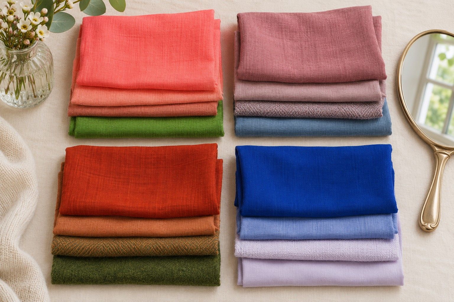
Lay the pair flat. Squint at both pieces together, or take one photo of them and look at a greyscale copy to check that they are roughly the same depth. This check is particularly helpful for peach, mauve and grey. A pale peach and a deep mauve can both look muted, but they will frame the face very differently for reasons that go beyond temperature. Keep the greyscale check for choosing pairs. Do your actual comparison in colour.
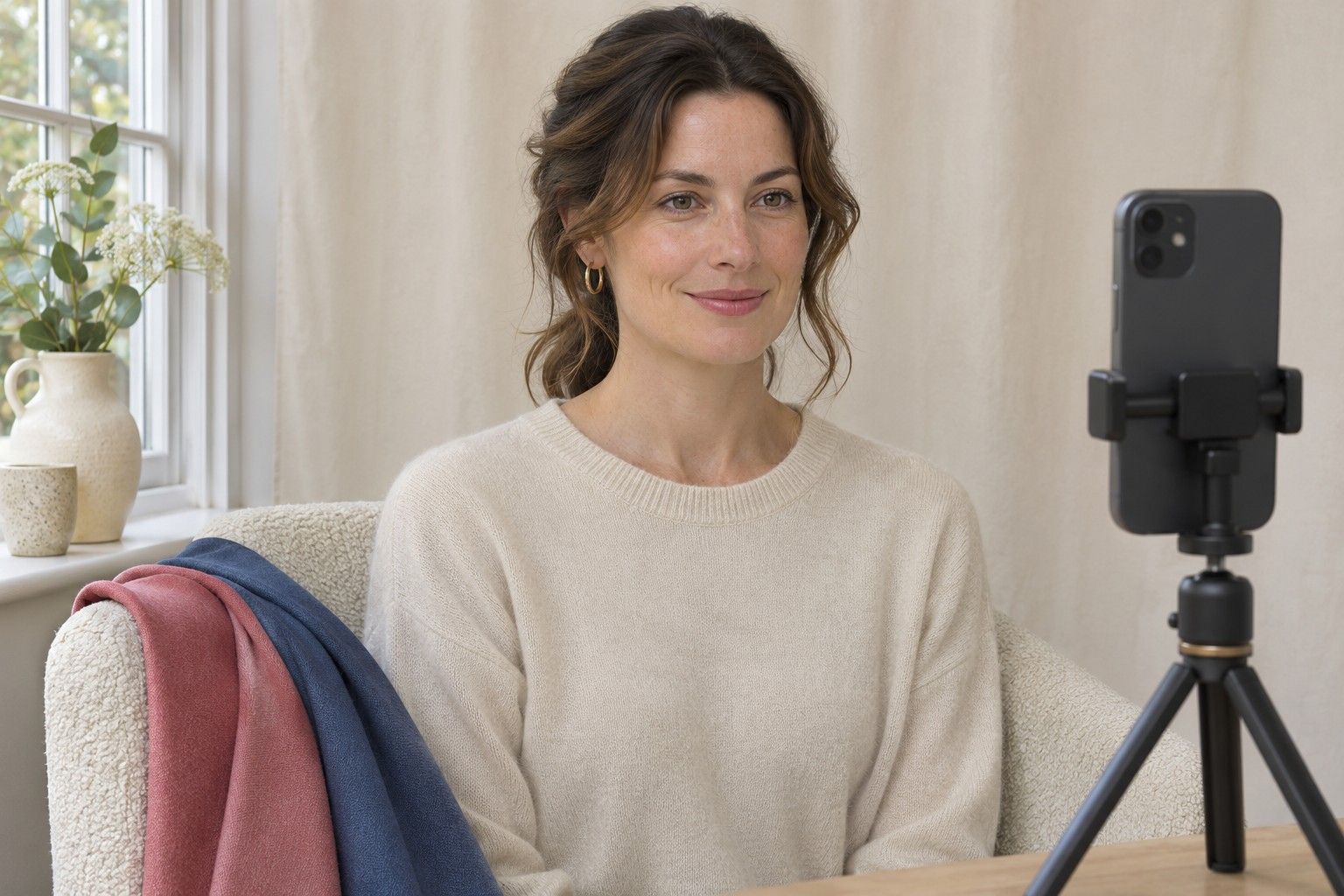
Cover any bright clothing with a plain towel and face a window out of direct sun. Hold each fabric at the same height and let it fill about the same area around your neckline. Try one switch with your eyes on your mouth and another with your eyes on the full reflection. The question is whether a shade makes it easier to see your features together. A darker area under the jaw or a sudden change in the prominence of the fabric may also give you something to record.
Compare pinks and browns in two matched pairs
Pair one uses dusty rose and soft clay pink. Dusty rose often has a blue or violet cast, while the clay pink might edge towards peach or red-brown. Choose pinks that could sit next to each other on a paint chart, with similar depths and a soft finish. Raspberry against burnt orange makes a different, broader comparison. Do the two nearby pinks first so you can see whether the extra warmth helps or whether it stands out more than you want.
Reverse the order on your second pass. If the clay pink feels strong only immediately after the rose, leave a short pause between fabrics with your gaze resting on a plain surface. Pay attention to the same area of your face each time. There is often a more repeatable observation in “the rose followed the natural colour in my lips” than in a general impression that the room looked warmer.
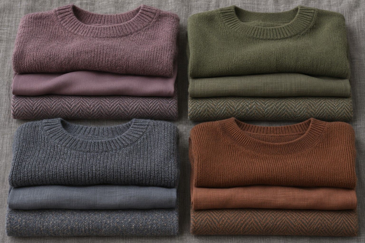
Pair two compares mushroom brown with another subdued brown that has a touch more gold. The mushroom may lean grey or violet. The warmer cloth could look like a muted biscuit, a soft cocoa or a lightly browned oat, as long as it is close in depth. Look for a golden cast by putting both beside a neutral grey napkin. A stripe, fleck or pale stitch can make a flat brown seem lighter up close, so compare the dominant shade when you pick your fabrics.
Use the brown test to see whether the pink preference repeats in another hue. For instance, rose and mushroom may both give you a calm, clear view of your features. A clay pink and warm cocoa might do the same in a slightly warmer direction. If your favourites split, note which shade fits in each hue before you go back to the season labels. Pink may be one of the areas where you sit closer to Summer, while your everyday neutrals may land towards Autumn.
Try two different neutrals
Pair three uses muted slate next to soft olive at a medium depth. The slate could be washed blue-grey cotton, and the olive should be soft enough to share a smoky look with it. Compare these at a neckline first, then move both lower and look from a little farther away. A strongly green olive worn in trousers can be an easy choice even when you like a bluer shade around your face.
Pair four compares a cool grey-beige with a warm oatmeal. Pick versions you could wear as an undershirt or a cardigan. The oatmeal can be yellowish without being golden, and the grey-beige can have a pink cast without reading as lavender. Pale fabric throws more light up towards the jaw than dark fabric does, so both should be as close as possible in lightness too. Keep a scrap of neutral cloth handy to help you detect changes if you can only look at one sample at a time.
Step aside and put an everyday layer over each of the two light neutrals. Try them with your washed-denim jacket, a heathered jumper or the olive you wore in the previous pair. The outfit version matters because you might like a cool pale top on its own and prefer the warmth of oatmeal with the jacket you wear most. Write each observation down separately. Then decide which of the two situations you do more often, so you know which colour is more useful as a first purchase.
Even an inconclusive test tells you something about the range you can wear. If both light neutrals work well and the slate and olive only look different as tops, pick the colour you prefer at the neckline and use the other one farther away. If every fabric in the test seems washed out, run a single check with a clearer shade at the same depth. It may be the muted quality that you are reacting to, which is worth sorting out before you spend more time trying to tell the soft palettes apart.
Build a shared palette while you decide
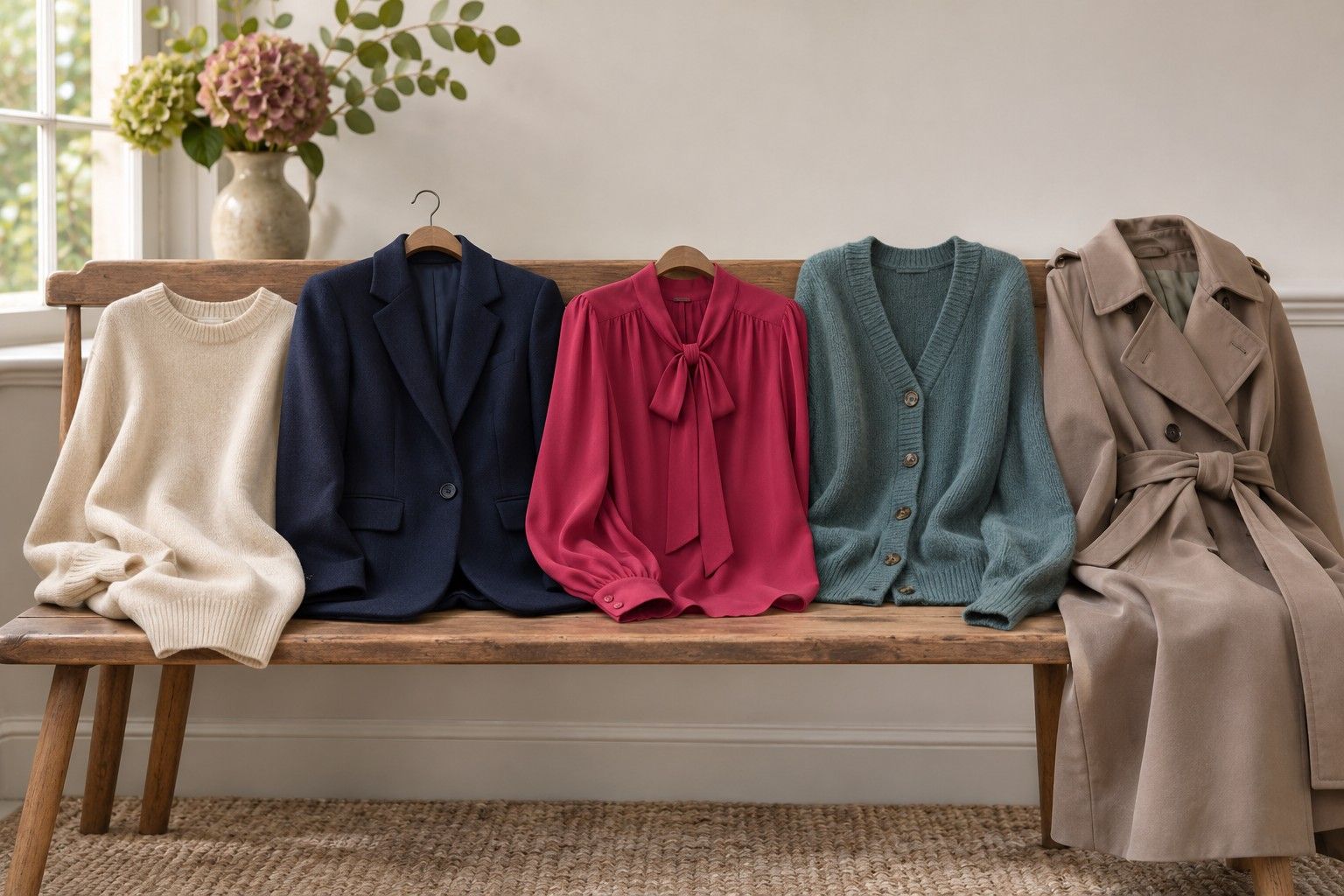
Start with one garment that already works and match new choices around it. A faded mid-blue jacket, a charcoal with a soft finish or a greyish chocolate bag can bridge enough of the shared range to be useful in either wardrobe. Look for colours with a fairly restrained cast, then repeat that cast in one other area of the outfit. A textured scarf with both soft blue and brown threads can pull two pieces together without making both neutrals look the same.
Near your face, try the shade with the most repeatable fabric result. If you chose dusty rose and mushroom as clear favourites, a soft wine scarf may be worth comparing with the rose for deeper outfits. If you preferred clay and golden-brown neutrals, the next test could be warm cocoa against a faded reddish brown. Keep the amount of colour similar. Even a pink with the same temperature can feel stronger in a large block than it did in a fine stripe.
There is room for your own preferences beside the fabric results. If you love olive, wear it in a skirt or carry it as a bag with a cooler shade above it. If pale grey is your most useful neutral but warm shades consistently work at the neckline, try a clay pink knit over grey trousers and judge the two visible colours together. The practical difference between Soft Summer and Soft Autumn may show up in which jumper you buy, rather than in whether most of the colours you own are worth keeping.