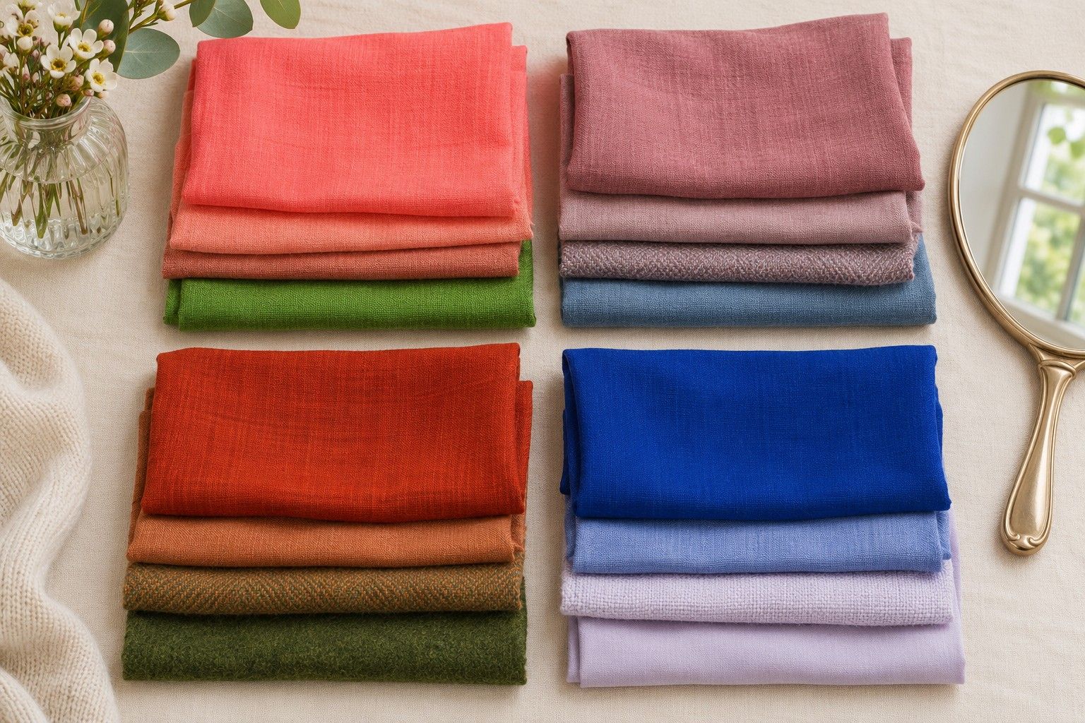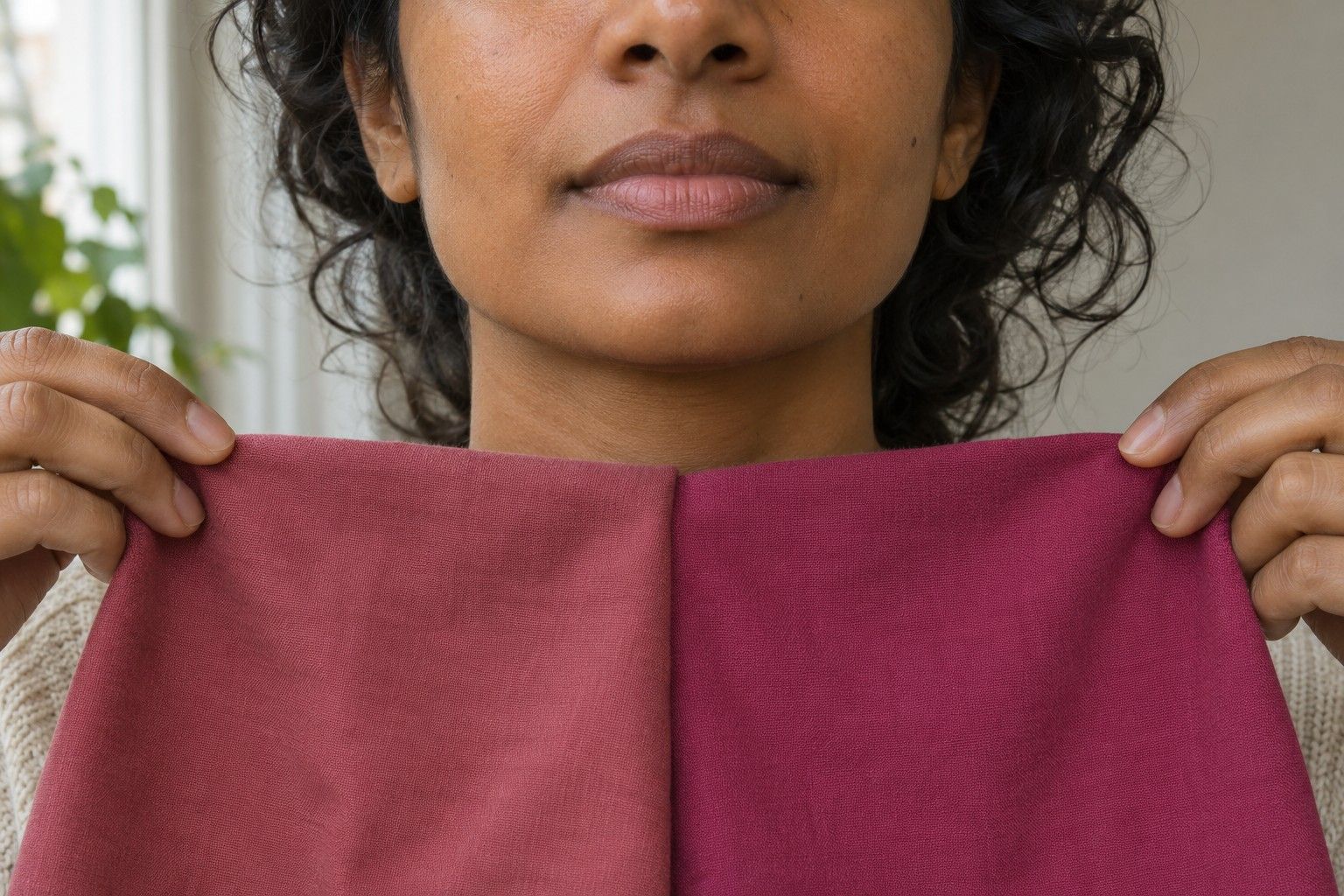
A skin undertone test works best when you can see the effects of two fabrics side by side. Try a warm rose and a cool raspberry of roughly the same depth, then switch the order and look again. What you are looking for is a repeatable relationship between your face and the colours you wear. A single glance at your wrist or a photograph taken under a kitchen lamp leaves too many variables open.
Separate surface colour from undertone
Surface colour is what you can readily see on a given day. You might have freckles across your nose, a recent tan, or flushed cheeks after walking outside. Those features are part of what you see in the mirror, but they can pull attention away from the rest of your face. In personal colour analysis, warm and cool describe how nearby colours interact with your overall colouring. You can begin testing that relationship even when your surface colour is difficult to describe.
Try looking at the area between the jaw and the upper neck in indirect daylight. Compare how it appears when you change your top. If a particular pink draws your attention to a patch of surface redness, make a note. Then check whether the shadow around your mouth or under your eyes looks different too. A broader change across several areas gives you more to work with than one spot near a blemish.
People often start by looking at blue or green veins in the wrist. The view of a vein depends on factors such as lighting and the surrounding skin. If you see blue in the morning and green later in the day, both observations can be sincere. Leave the veins out of your scoring and put the time into one controlled fabric comparison. You can keep a note of the colour you see if you are curious about why the old rule gave you an unexpected answer.
Prepare matched warm and cool fabrics
Choose a bright window without direct sun. Turn off nearby lamps, sit facing the window, and use a wall mirror or a mirror that does not add its own illumination. Place a grey or neutral cloth over a colourful top so it cannot compete with your test fabric. If your dyed hair changes the comparison dramatically, try tying it back for the first round, then let it down to see which colours work with the hair you have now.
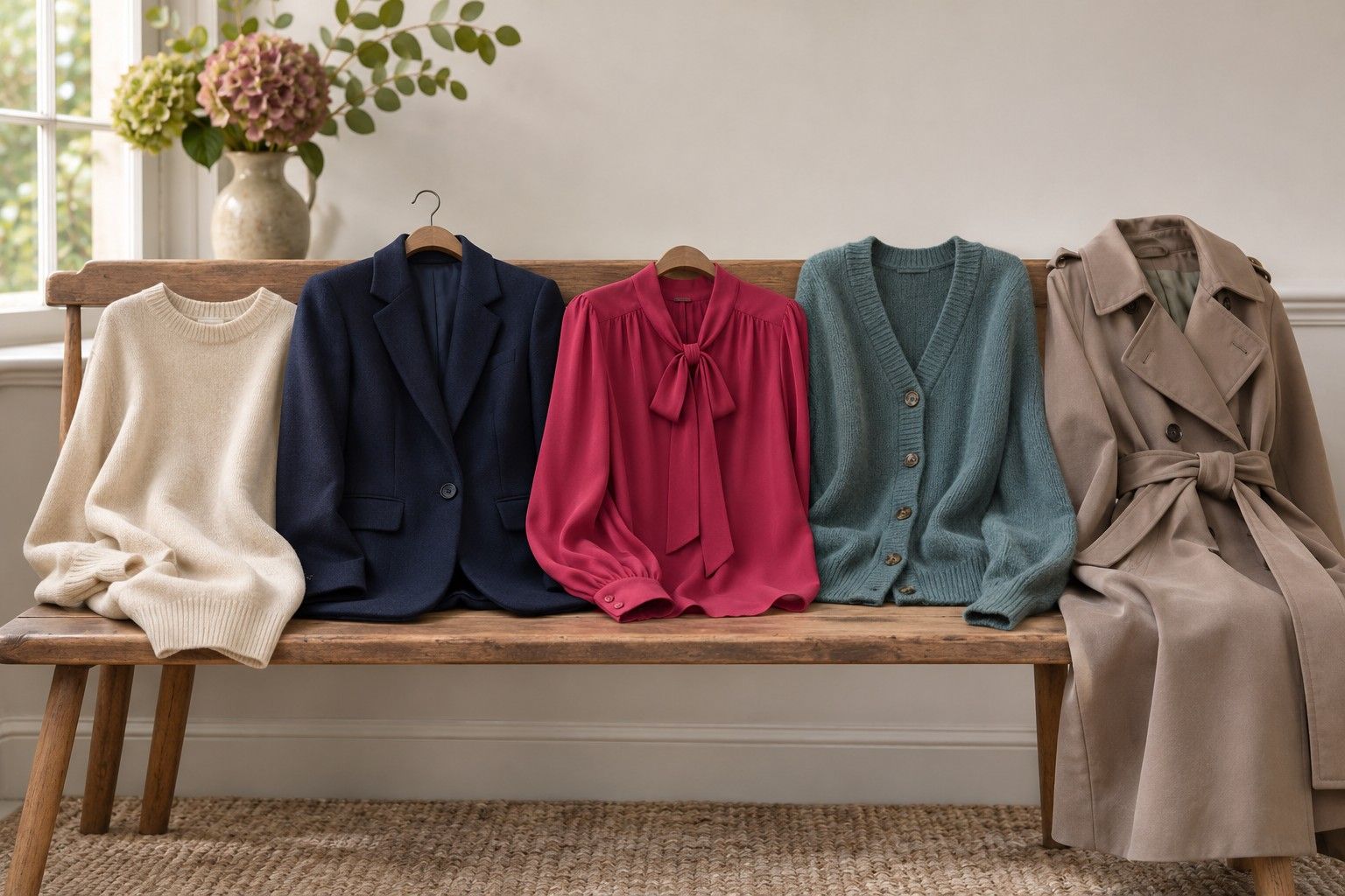
Look through your wardrobe for two pieces of similar depth and finish. A medium rust T-shirt and a medium berry T-shirt can work. A rust velvet jacket beside a pale lilac scarf introduces shine, depth and plenty of texture. In that case, you might be reacting to how brightly the lilac reflects light rather than to its temperature. Lay the two pieces flat first and check how different the tones appear when you half-close your eyes.
Treat each fabric as a single colour sample. Fold it to hide printed logos and narrow stripes, bring it to the same height under your chin, and give it the same area against your neckline. If you wear glasses daily, you can do the first set without them and repeat with them. Warm tortoiseshell frames and bright silver frames will both affect the overall combination you see in a reflection.
Aim for three comparisons. A muted terracotta and a muted rose are a useful middle-depth pair. A warm ivory and a cool off-white can work for lighter colours if the two are similarly bright. A medium tobacco and a cool plum give you a darker comparison if the other pairs are too pale. A true match will be imperfect with household fabrics, so write down the biggest difference in each pair before you score.
Record consistent visual differences
Hold the first fabric up for a few seconds and note which facial feature you notice first. Cover it with grey for a moment before introducing the second. Look for specifics such as a clearer lip outline, a harsher shadow near the jaw or eyes that hold your attention without making the fabric disappear. Write down what you saw before deciding which looks preferable. If you simply like the red scarf more because it was a gift, that is worth recognising separately.
Test each pair in the other order. Being surprised by the first fabric does not always mean its colour works particularly well. The opposite order can reveal that you were mostly reacting to a large jump away from grey. On days when your colour perception feels uncertain, ask someone nearby to describe what changes using the same questions. Give them both pieces before sharing your preference.
Use a three-column note with the pair, the shade you preferred and the observed change. For instance, you might write that muted berry makes the eyes easier to see, ivory and off-white are tied, and cool plum softens the jaw shadow. That is a modest cool tendency with a useful exception at the light end. If you score the neutral test first, you can keep its result separate from the accents you are most likely to buy.
Repeat a close result at about the same time on a different day. A grey afternoon may work fine, but comparing it to an evening with warm light behind you can produce an entirely different impression. Pick the time when you usually have even light and store the fabrics together. The second test is far quicker when you use the very same samples.
Handle ambiguous comparisons
Warm and cool pieces sometimes look equally good. Check whether both pieces are similarly dark, or both are slightly muted. If they share a quality that matters more to you than temperature in that comparison, test that quality on its own. For example, keep the cool plum and swap in a brighter cool magenta at the same approximate depth. If you reliably favour the softer colour, you have found a practical clue even if your temperature notes remain mixed.
A few pairs can be hard to score if you like one part of each result. A warm red may make your eyes stand out while a cool red gives you a more even-looking cheek. Decide which effect matters for the garment you are choosing. You may want a stronger red at a party and a quieter colour for a daily work top. Keeping both observations will make more sense the next time you stand in front of a shop mirror.
If nothing changes clearly, give the fabrics more area or use a stronger warm and cool pair at the same depth. Pale greyed fabrics can be very close and produce little visible difference. Start with familiar tops that have fuller colours, then return to subtle shades after seeing whether the stronger pair helps. Make room for an undecided result if matched pairs keep splitting.
Take the strongest pair from your notes and wear each fabric with the same jeans or coat on different days. That gives you a comparison in ordinary use. You may discover both colours are wearable and one is especially easy to pair with your other clothes. The notes you made in daylight will still be helpful when a shop calls one top brick and another top rosewood.