Two colour analysis quizzes can send you to different seasons even when you answer them the same way. A 12-season result might say Soft Summer while a 16-season quiz gives you Deep Summer. There is a practical way to settle what that change means. Put the labels aside for a minute, put three or four fabrics next to your face, and see whether the new palette gives you a better choice of colours for the things you actually wear.
Understand how the models differ
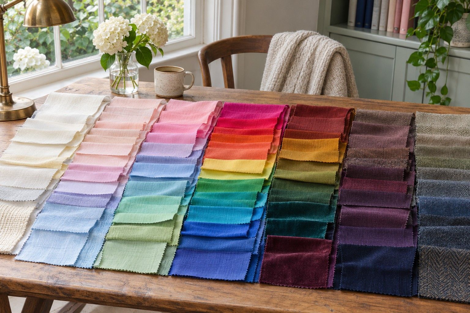
Most 12-season charts divide Spring, Summer, Autumn and Winter into three groups each. Temperature is one clue, with warmer colours running towards gold, peach or yellow and cooler colours towards blue, pink or violet. Then there is depth, which describes how light or dark a colour looks, and clarity, which distinguishes a vivid shade from its dustier counterpart. Summer palettes tend to be cooler and more muted, for instance, but a pale lavender and a smoky ink blue occupy quite different parts of that range.
A 16-season colour analysis quiz can use extra groups to describe colours that fall between the usual choices. Suppose you repeatedly prefer the cool, subdued colours associated with Summer, but find its light greys look chalky beside your face and keep reaching for darker smoky blues. Some systems offer a Deep Summer category for that combination. Another system might place you in Soft Summer and give you its darker shades. The recommendation can overlap even when the name changes.
Check how the tool arrives at its answer. A quiz that asks you to compare fabrics gives you a different kind of evidence from a quiz that mainly uses your natural hair and eye colour. A person with very dark hair can still prefer a softer palette, and icy eyes do not make every vivid blue a good choice. If two quizzes gave different results, see whether both asked about your response to muted colours, or whether one inferred that response from your features. That distinction is more useful than the number of questions.
Read the extra palette labels
There is no single set of names used by every 16-season system. An extra season may describe an edge of a family, and the word True sometimes describes a balanced version of that family rather than a strong temperature preference. When a result page gives you a chart as well as a name, compare the chart with its immediate neighbours. If a label is unfamiliar, the swatches should help you work out what the quiz expects you to do with it.
| Label you might see | What to inspect in that system’s chart | A practical pair to test |
|---|---|---|
| Deep Summer | Whether the dark shades keep a cool, softened finish | Smoky navy and equally dark, clear navy |
| Soft Winter | Whether greyer jewel tones sit alongside deep, cool neutrals | Muted blackberry and a clearer blackberry of similar depth |
| Soft Spring | Whether the lighter warm colours are gentler than those in its classic Spring chart | Soft apricot and a brighter apricot in the same fabric finish |
| True or Pure season | Whether it represents a balanced family palette or its strongest undertone | Two shades from the same family, one more noticeably warm or cool |
Look for the difference that would show up at a shop rail. If one chart suggests a smoky red and the other a cool cherry at very similar depths, that is a useful comparison. If your two charts each show a navy that looks nearly identical on your screen, treat navy as a shared option until you have cloth to compare. Tiny colour differences on a phone can change with brightness and display settings, and the same named navy comes in a range of dyes.
Compare colours across systems
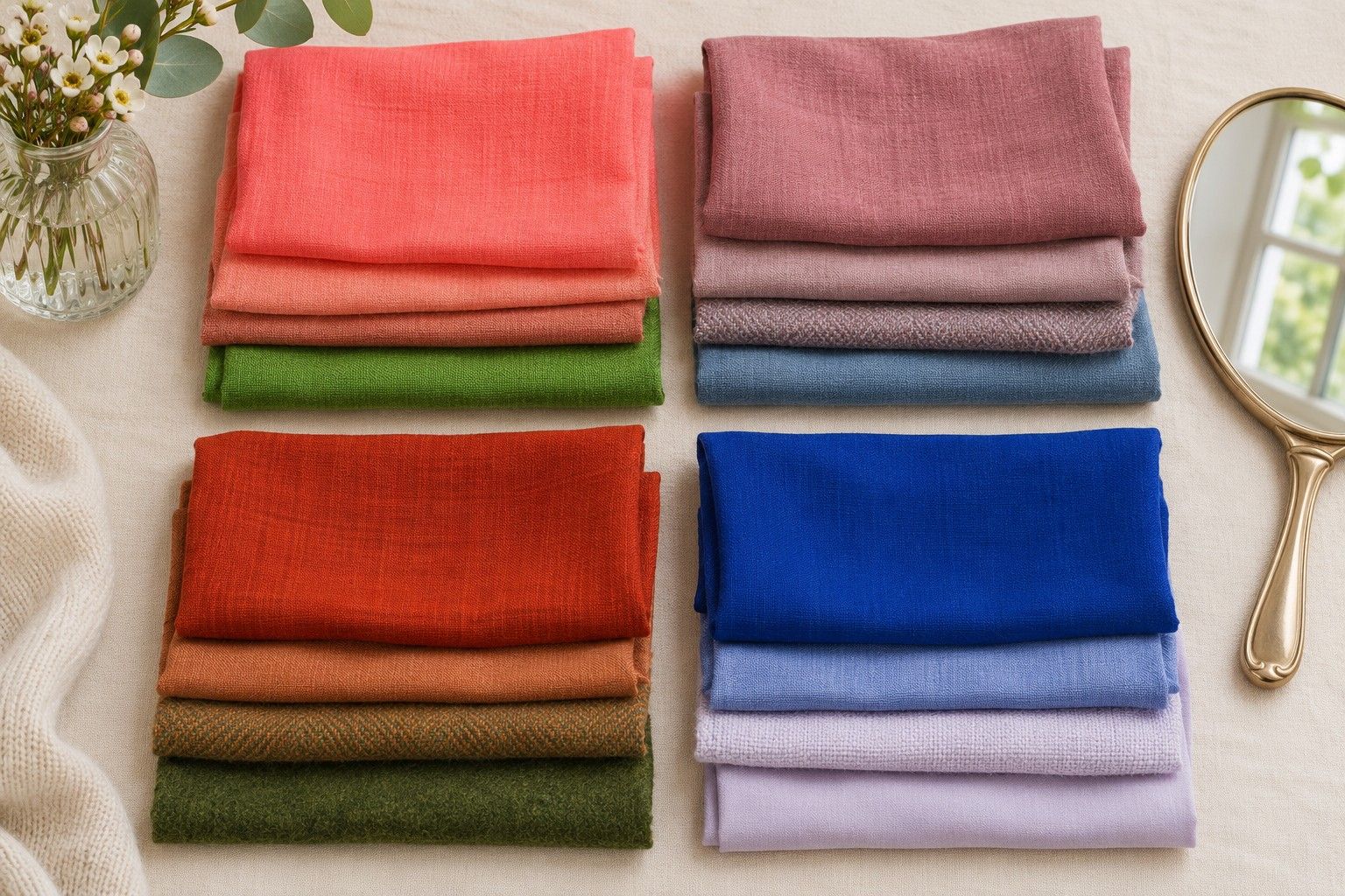
Find one close pair for each quality your results disagree about. For temperature, try a dusty rose and a soft terracotta that look equally dark when you squint. For depth, use a mid-grey and a dark grey with a similar undertone. For clarity, put a subdued raspberry next to a slightly brighter raspberry instead of choosing a completely different hue. Plain fabrics with similar finishes keep the comparison readable. A shiny scarf and a matte sweatshirt introduce reflections and texture even if the dyes look close.
Stand facing a window out of direct sun with your shoulders covered, and use the same mirror and background for both fabrics. Bring each one to the same place just under your chin. Switch twice at a steady pace. Look at how easily you notice your features, whether shadows around the mouth appear more prominent, and where your eye lands first. If the change is hard to see, write “unclear” and move to the next pair.
Test your strongest result against a second set from the same colour dimension. Cool raspberry winning against terracotta could reflect a preference for that pink. Cool blue-red winning over tomato red, at a similar depth and brightness, makes the pattern easier to interpret. If the second pair disagrees, look for a difference you missed in the first pair. Many warm and cool reds also differ sharply in lightness or vividness.
Consider how often your answers to the quiz depended on a guess. If you chose warm based on a foundation label you have worn for years, see whether that lines up with the paired fabrics. If you chose soft because you like faded denim, check a softer and a clearer top. Those checks can be more revealing than retaking the same quiz ten times. If you do retake it, note the one answer you changed and watch which part of the recommended palette changes with it.
Translate the result into a shortlist
Make a small physical palette from the two recommendations. Start with a neutral they share and a shade each chart treats differently. Somebody deciding between Soft Summer and Deep Summer might keep smoked blue as the shared colour, bring in a medium dusty rose from one chart and add a cool, darker plum from the other. These are fabrics to check with a whole outfit and may shift once you see them against the neckline and accessories you normally wear.
The choice may also depend on the size of the colour patch. A slightly clearer blue that feels conspicuous in a high-neck jumper can be welcome as a stripe or an earring. A soft pale blue that disappears beside your face can make a useful shirt layer with a dark jacket. Take your own clothes into account before you cross any colours off. A palette that works at the scale of a wool coat can leave room for a very different scarf.
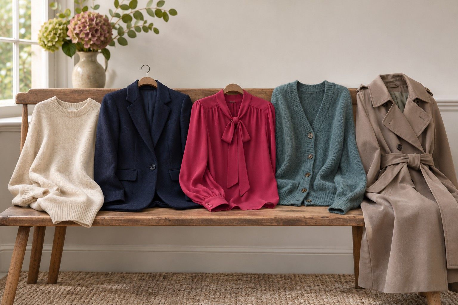
If you are looking to buy something, start with the most frequent decision in your week. Someone who wears black trousers to work can compare two new tops with those trousers and the same shoes. Someone who cycles through denim and white tees might look for the scarf or overshirt that brings the most useful colour to a familiar combination. Test the fabrics at home before replacing a foundational piece, and leave the close calls on a separate list.
Keep the label beside the name of the system if you want a record. “Deep Summer in this quiz, smoky navy and plum tested well” will help you find a matching jumper months later. “Deep Summer” alone may lead you to a different chart. Once you can describe the colours you reached for in terms of temperature, depth and clarity, the 12- and 16-season results can both serve as starting points for the same wardrobe.