A wardrobe can feel coherent even when the warm and cool parts of an undertone test come out level. Think of a stone shirt with deep petrol trousers or a dusty rose knit under an olive coat. Those colours can work together because their depth and softness relate to each other. Use the following comparisons to find the qualities that make your own choices easier.
Identify close warm and cool results
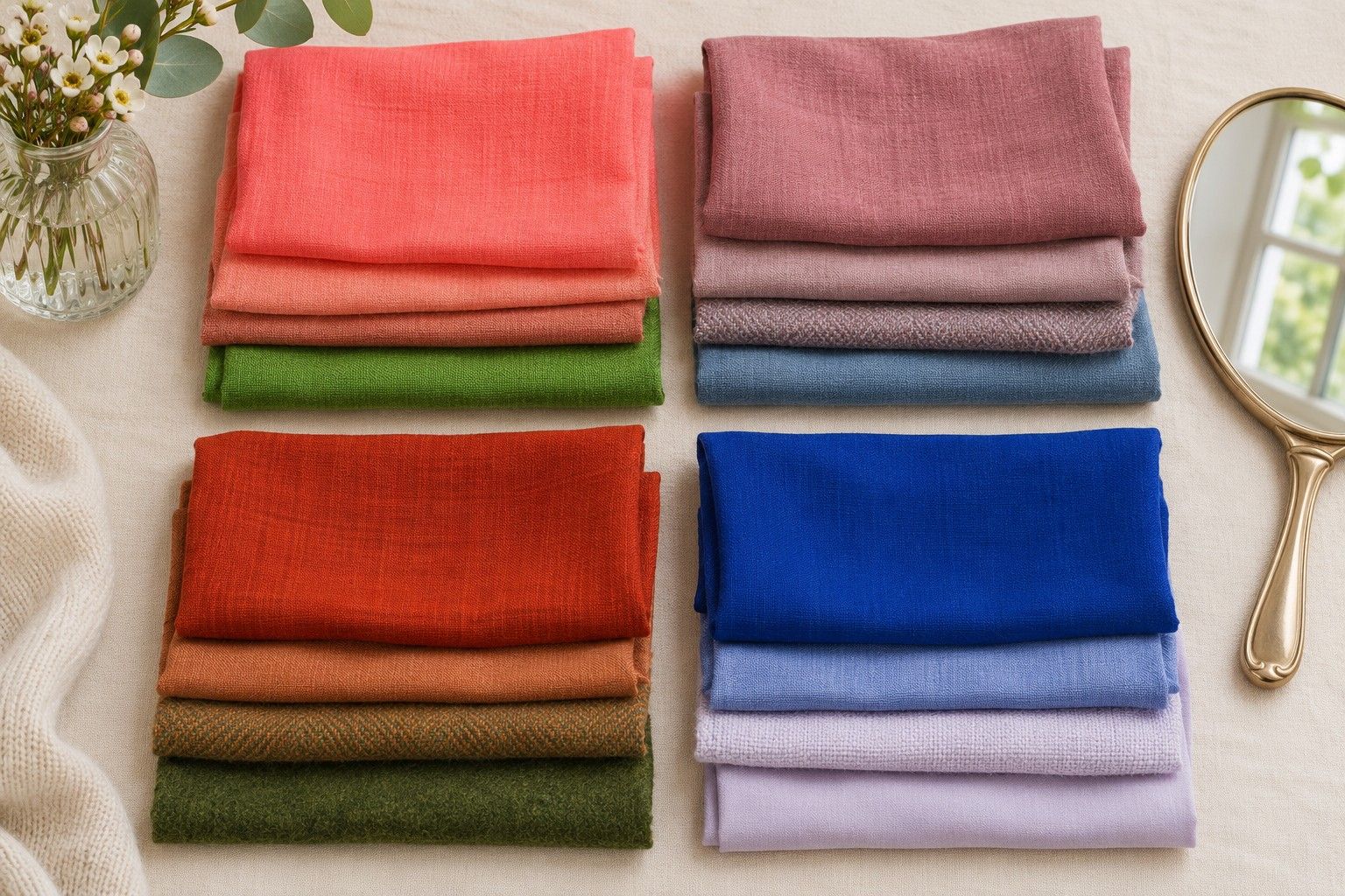
Take two tops from your wardrobe that sit on either side of the warm and cool divide. A soft peach and a soft pink can work if they look equally light and muted. Stand by a window with both pieces folded to the same width. Hold each below your chin and observe the jaw, cheeks and the area around your mouth. Swap the order before you make a choice. If the same shade wins twice, keep that observation. If you still find it hard to choose, mark the pair as a tie.
Repeat with a darker pair such as muted burgundy and terracotta. Try a third comparison with fog grey and mushroom if you have those colours at a similar depth. A tie across several pairs suggests that colour temperature may have less influence on your clothes than it does on someone with a consistent preference for very warm or very cool colours. A tie in one pair can simply reflect how close the two fabrics are.
Notice whether your preferences change with the colour family. You might prefer cooler pinks and slightly warmer browns. A dark warm brown could work because its depth matches your features, while a very light yellow beige makes you look tired in the same light. That information is more useful on a shopping trip than forcing all your choices into one temperature category.
Record the light as well as the fabric. If the test looks completely different at the office, light may account for part of the change. Try wearing your top through a morning indoors and a short walk outside. A shade that feels comfortable in both settings makes a better staple than one that only works directly under a flattering window.
Compare light and deep neutrals
Take an off-white, a middle taupe and a deep charcoal or navy. Give each one the same area below your face. The light piece may make you look fresh on its own but create a sharp line where it meets a dark coat. The deep piece may frame your face well but hide details if the neckline, glasses and trousers are all equally dark. Observe the fabric by itself first, then put the outfit together.
Use your black and white phone preview as a secondary check for depth. Colours with very different hues can look almost identical in greyscale. That explains why a slate shirt and an olive jacket may blend into one block in a photograph. If you want clearer separation between them, change the slate to a lighter grey or add a pale neckline. Keep the original colour view for assessing warmth and saturation.
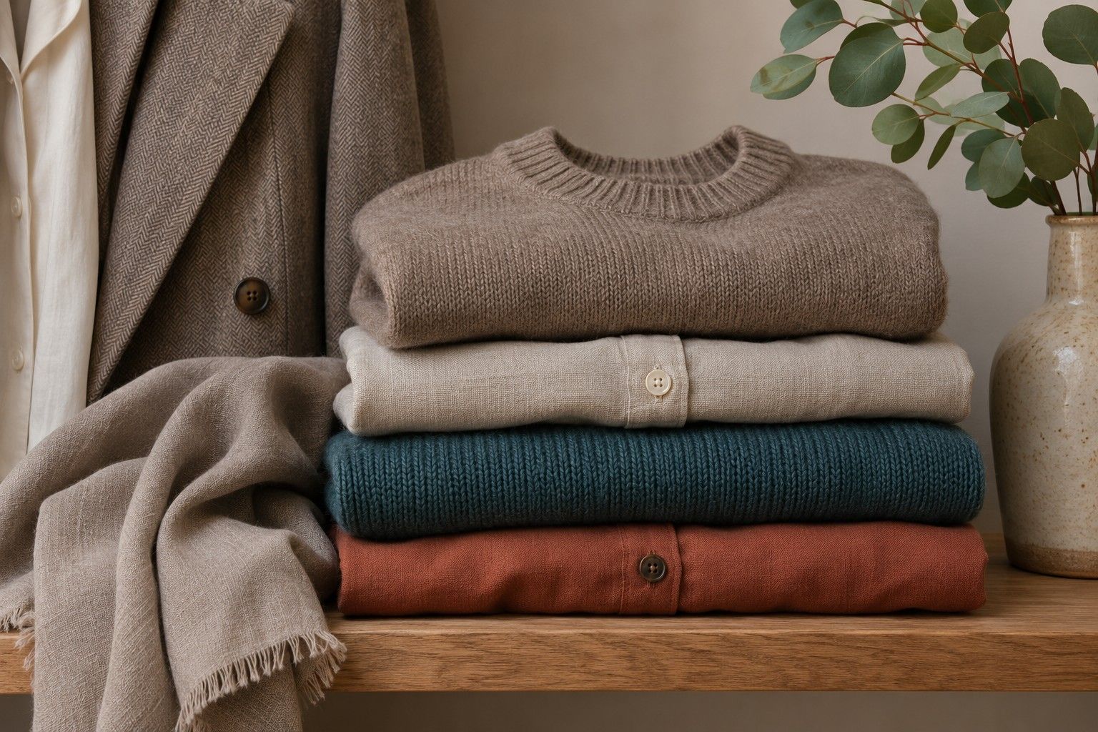
Start a neutral undertone colour palette with two neutrals you already like together, such as cool charcoal and stone or indigo and oat. Put them on and check the combination before buying a third neutral. A mid-depth piece adds flexibility when it works with both. A mushroom cardigan may bridge dark trousers and a cream shirt when a second dark cardigan creates an outfit you already own.
Watch how fabric changes a neutral. Black denim with a washed face has visible greys that a smooth black satin lacks. A cream shirt in soft linen can look quieter than a smooth cream silk even if both look similar on a hanger. When you replace a worn favourite, bring the original or a fabric sample so you can see the difference under the same light.
Find a workable saturation range
Compare two versions of one colour, such as muted petrol and a cleaner blue-green. Keep their depth close. If the cleaner version commands attention before you see your face, try a smaller area, perhaps a collar, ear accessory or plain strip of neckline. If the muted version seems to merge with everything you wear, put it beside a quieter neutral and see whether the extra separation helps.
Run the comparison separately for reds, greens or blues that already turn up in your wardrobe. There is no need to buy four shades of every colour. A borrowed scarf or the folded edge of a shirt is enough for an initial try. Record the shade and the fabric. A woven red with a chalky finish may be a much easier everyday colour than a glossy red with the same apparent hue.
Pick two accents at the edge of your comfortable range. You might like a dusty teal in a full knit and a brighter raspberry in a scarf. Test both with the same neutral pair. The goal is to know when to use each accent. Matching the size of the accent to its intensity helps you wear a colour that feels too strong as an entire coat.
Change one thing at a time when you review the result. A cleaner scarf worn with a paler coat and brighter earrings brings three changes into the mirror. Start with the same clothes and swap the scarf. If there is still a strong difference, repeat with a smaller fold of the cleaner colour. A useful wardrobe note might read that the medium dusty teal works as a top, while the brighter blue-green works in a short scarf.
Build a mixed-temperature outfit
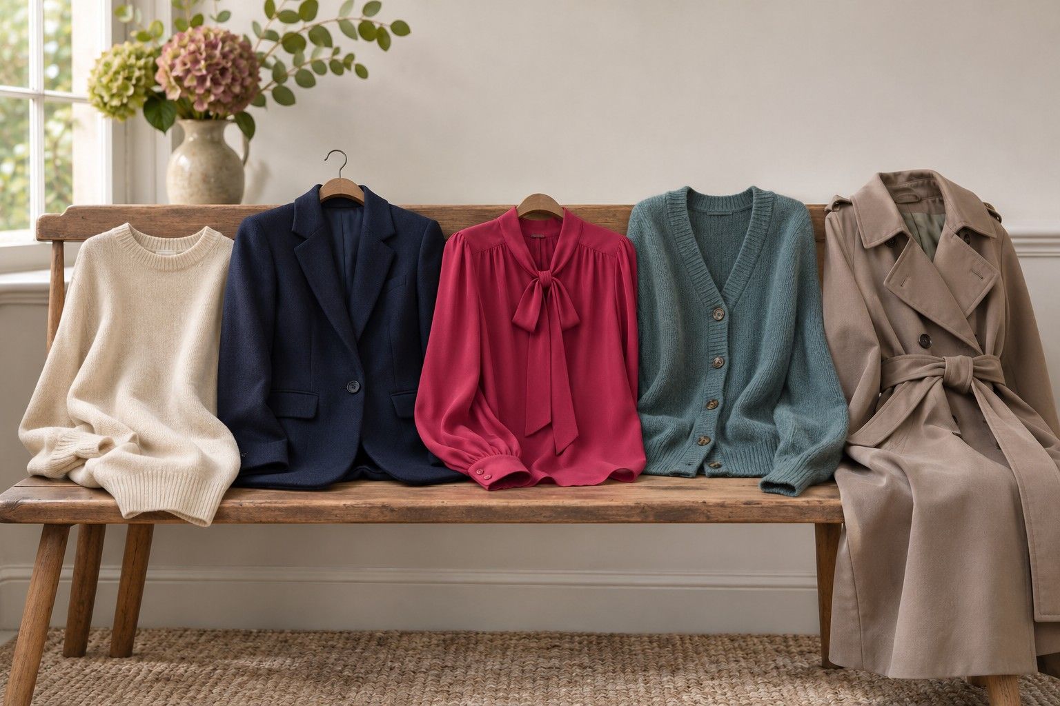
Start with one piece you wear often. If it is a warm taupe jacket, look for a nearby cool shade with a similar softness. A dusty blue shirt and a deep navy trouser can make the jacket feel intentional. Try the same jacket over a much brighter cobalt shirt to see whether you prefer the quieter balance or a distinct colour accent. Let the mirror tell you which effect fits your day.
Give the two temperatures a shared quality. Dark olive trousers and a cool aubergine knit share depth. A soft cream tee and light dusty lilac share low contrast. If a combination feels accidental, check the depth and saturation before changing the colours. Shifting from vivid lilac to a softer lilac may solve the problem while keeping the cool shade you wanted.
Try reversing which colour sits by your face. A cool blue top and warmer trousers may feel more natural than a warm jacket over the same blue. You can keep the warm piece further away as a bag or belt. If the warm jacket is the piece you need, bring back a quiet blue or cream edge at the collar and compare. A neckline can change how an outfit reads without changing its overall colours.
Photograph two combinations you would willingly wear again. Keep the images somewhere handy when you shop for a replacement piece. Start with a small set of repeatable outfits and expand once you have used them in the places you dress for. Your neutral undertone colours are the shades you can compare, combine and wear comfortably over a full week.