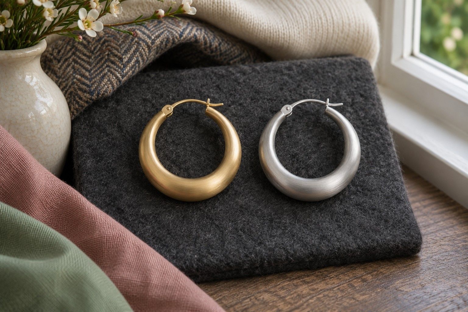
Put one gold and one silver piece on the table and check which is easier to wear near the face. A gold or silver test photo can help you revisit the comparison later, especially if both pieces looked good in the mirror. Start with jewellery of similar size and finish and keep the rest of the outfit the same while you swap them.
Match finish and scale before you pick a metal
A fine gold chain and a large shiny silver pendant answer several questions at once. You might be reacting to the weight of the pendant in the outfit, the sharpness of the polished surface or the longer line it draws down the chest. Give the metal colour a fair chance by comparing two chain necklaces of similar length or two sets of small hoops with a comparable width. You can hold single pieces near the ear or under the chin if you have no matching pairs.
Put the two pieces beside one another under a window. One silver piece may look white and bright where a darker or brushed finish looks closer to grey. Gold can range from a pale soft yellow to a rich, almost orange shade. Match the amount of shine wherever you can. A softly brushed yellow gold ring and a satin silver ring can make a very different test from two highly polished hoops. Write down what you used so you can compare the result with another pair later.
If the only pieces available are very different, try to match the visible area. Hold up a segment of the heavy chain alongside a similar length of fine chain, or use two small pendants and hide their chains behind the fabric. This is still a rough comparison because thickness and texture differ. It can show you what to test next. A surprising preference for a pale gold hoop, for example, is a good reason to try a quieter silver hoop before committing to a gold finish for every piece.
Gold-tone and silver-tone jewellery are fine for a colour comparison. Use pieces with a reasonably even finish so a patch of exposed base metal gives you fewer stray highlights. Check for coloured stones, pearl surrounds or enamel that could account for the difference. A blue stone in a silver setting brings cool colour close to your face on its own, especially when the stone has a greater surface area than the metal.
Compare both pieces against a plain neckline
Stand facing indirect daylight and wear a plain top that gives the jewellery some room. A medium grey crew neck, or an open neck with a subdued top below it, is enough. Check for colour reflected from a nearby scarf or curtain. If half your face is in shade, shift the mirror so you can see the same light on both sides. Close both necklaces at roughly the same point along the chest if their chains are adjustable.
Put on one piece and look at it from your usual mirror distance. Give yourself time to look at your face as well as the jewellery. Does the piece catch your eye before anything else? Does it make the neckline look brighter than you expected? Try to describe the effect in a few words, such as ‘soft at the neckline’ or ‘bright enough to draw my eye’. Put it down and replace it with the other piece. You can repeat the swap with the order reversed after a minute.
For earrings, put each piece on the same ear in turn and keep your head in the same position. A gold hoop worn towards the window will catch different reflections from a silver hoop worn on the far side. Look straight into the mirror, then turn a little and see whether your first impression survives a small change in angle. If one piece flares white as you turn, pay attention to what it looks like once the reflection has passed.
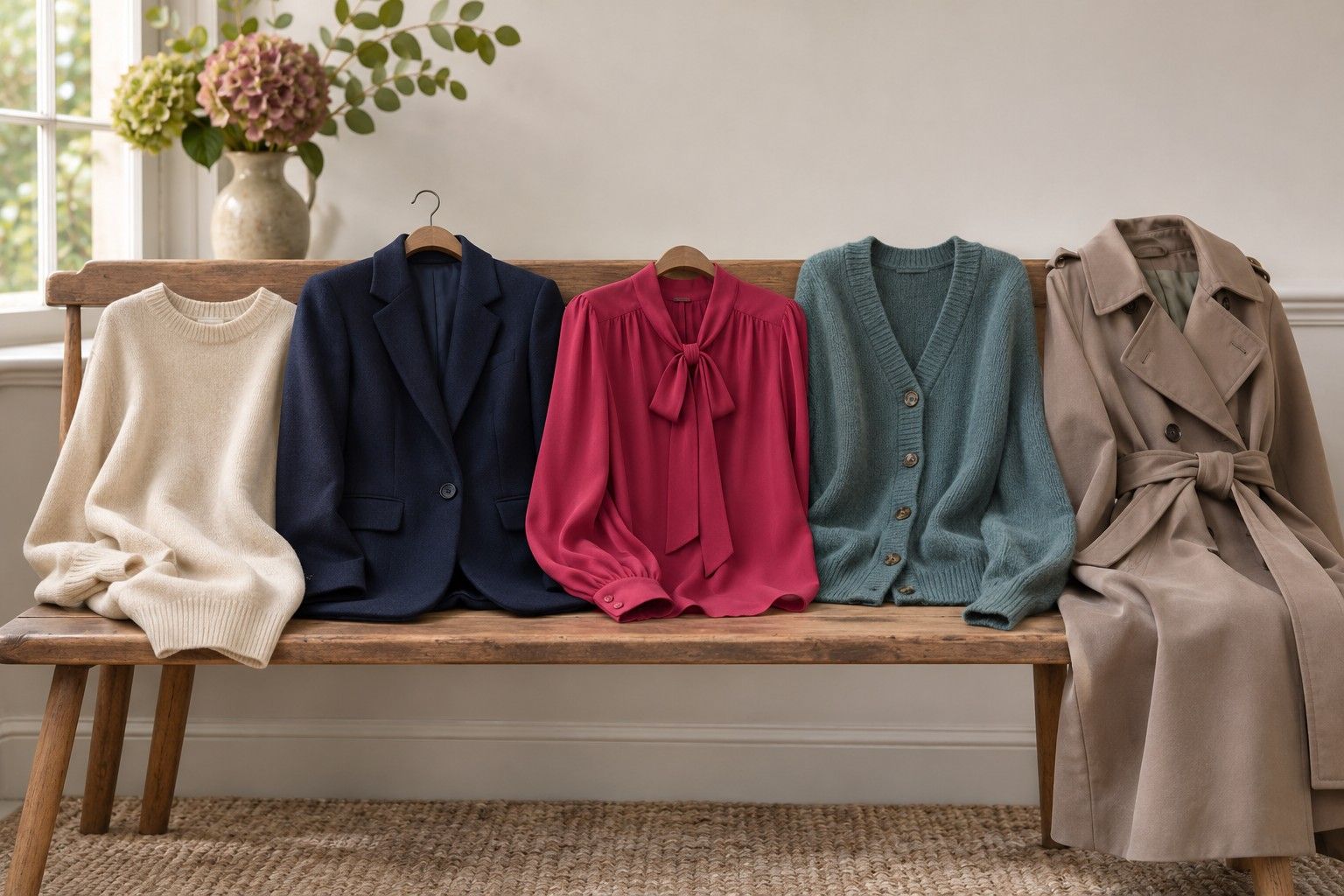
Try both metals against a second top once you have made the plain comparison. Choose one you already know you wear often. A warm red knit may make a soft gold necklace look almost continuous with the outfit, while silver makes a crisper point of contrast. With a blue-grey shirt the relationship may reverse. Keep the plain top result on its own line and describe what happened with the knit or shirt below it. Those results answer different wardrobe questions.
Check for camera colour shifts in your photo
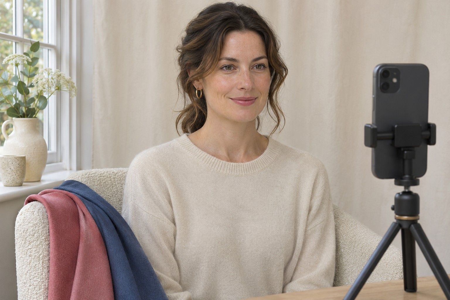
Set the phone at eye level on a shelf or stand. Use the same angle, distance and camera for both frames. Switch off portrait effects or filters that alter the way the skin and highlights are rendered. If your camera app lets you lock exposure and white balance, do that before the first frame. If those controls are unavailable, take the second photo soon after the first. A moving cloud can change the colour and brightness of the window light between shots.
Include the same plain reference in both frames, such as a muted grey scrap at the edge of the shot. Look at the scrap before you compare the jewellery. If it looks darker or more yellow in one photo, the lighting or camera rendering has shifted. Repeat the pair. If one metal catches a reflection of the room, change your position slightly and do both frames again from the new spot. Judge the pieces first at normal viewing size and zoom in afterwards to check for harsh highlights.
A colour cast can come from the phone screen as well as the camera. Open both frames in the same gallery on the same screen and look at them with that screen's warm night setting paused if you use one. Keep the brightness steady. Matching screen settings will help you compare the frames with each other, although the jewellery may still appear different in person. When the photo and mirror disagree, repeat the daylight comparison and decide which effect matters in the setting where you wear the piece.
For a close pair, start with a third photo of both pieces lying next to each other on the same neutral fabric. That frame shows the shade and finish differences under one exposure. Follow up with the two wearing photos to see the scale and position. Forcing both pieces into a single image of the face is less useful if one sits on the shadow side or if you normally wear both as part of a matching pair.
Apply your result to the jewellery you already own
If you prefer silver near your face, try using it for familiar daily earrings and keeping a favourite gold ring in rotation. If medium gold looked especially good while polished silver looked too sharp, try a brushed or oxidised silver finish next. That comparison tells you whether the strong reflection drove the result. If a pale champagne gold and satin silver both suit an outfit, you get two easy options for the same set of clothes.
You can also put a metal that feels strong at the neckline farther away. A gold bracelet gives a navy shirt a small warm accent. A silver brooch on a dark coat makes a sharper mark than a thin necklace beneath the coat. When wearing mixed metals, repeat one feature across both pieces. Two delicate chains of similar scale often sit more comfortably together than a delicate chain and a heavy pendant with a large coloured stone.
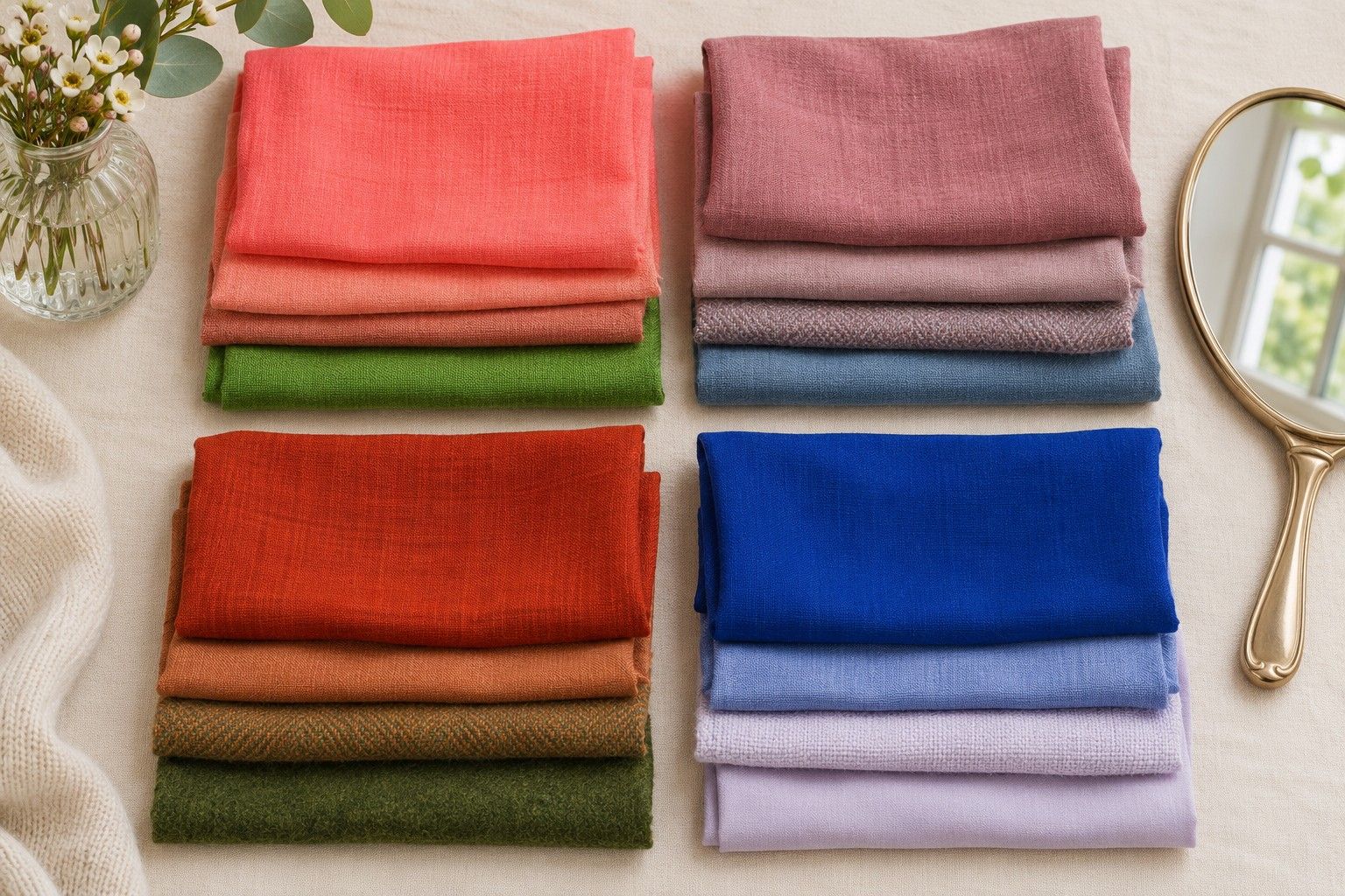
Jewellery can give you a lead for seasonal colour analysis. Two gold pieces that both work well might prompt a warm-versus-cool fabric comparison near the face, using two shades that are close in depth. The finish, style and colour of a metal can all matter independently of the colours you like in clothes. Keep notes about the pieces and outfits where you see a clear effect. A personal colour palette and a jewellery box both have room for more than one metallic finish.