Take a high or low contrast face test by turning a daylight photograph to greyscale and comparing the lightness of your skin, hair and facial features. Use what you see to try a quieter or sharper combination of clothes near your face. A greyscale picture makes light and dark easier to judge, and a couple of fabric swaps can show you how much of that contrast you want in an outfit.
Take a controlled photograph in even light
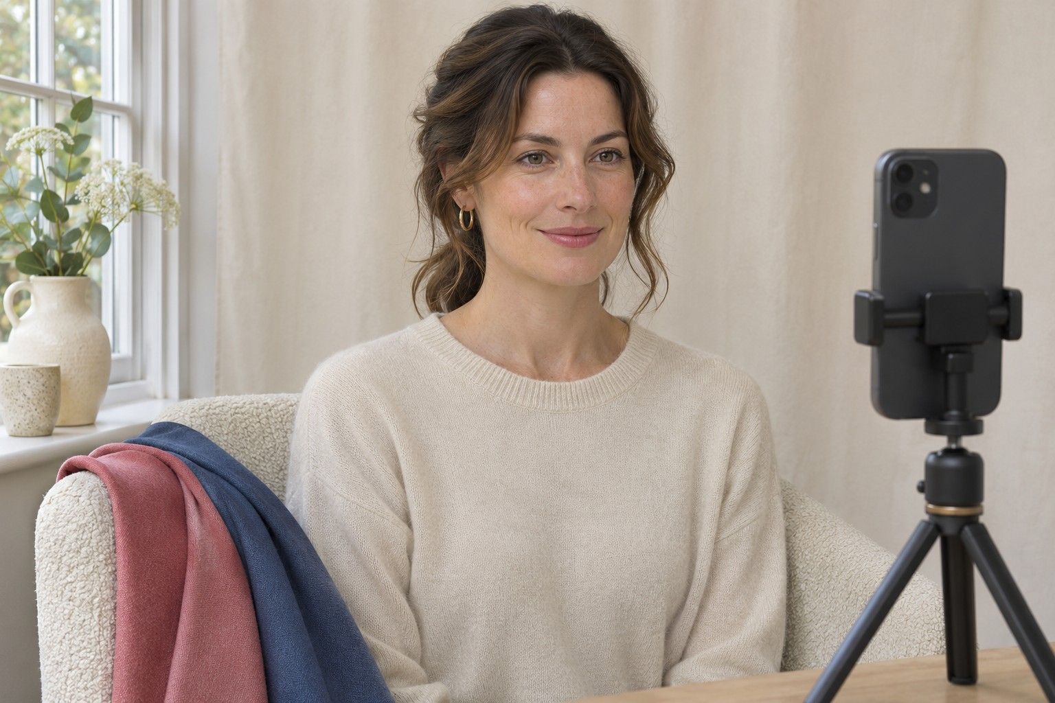
Put your phone at eye level and face a window with indirect daylight. A cloudy sky can make that easy. On a bright day use a window out of direct sun or step back from the glass until both sides of your face are evenly lit. Switch off any lamp that leaves one side bright and one side dark. A plain background makes it easier to see the outline of your hair. Leave space at the top and sides of the picture so you can see the broad shape before you zoom in.
Wear a plain top and move the camera far enough away to make the whole head and upper chest fit comfortably. Strong overhead light often leaves a shadow under the fringe or makes the eye sockets look darker. Start over if you see a prominent shadow that is clearly stronger on one side. Turn off beauty filters and use an ordinary photo setting. If you wear strongly tinted makeup, take the photo before applying it or make a second version with your usual look for a separate outfit check.
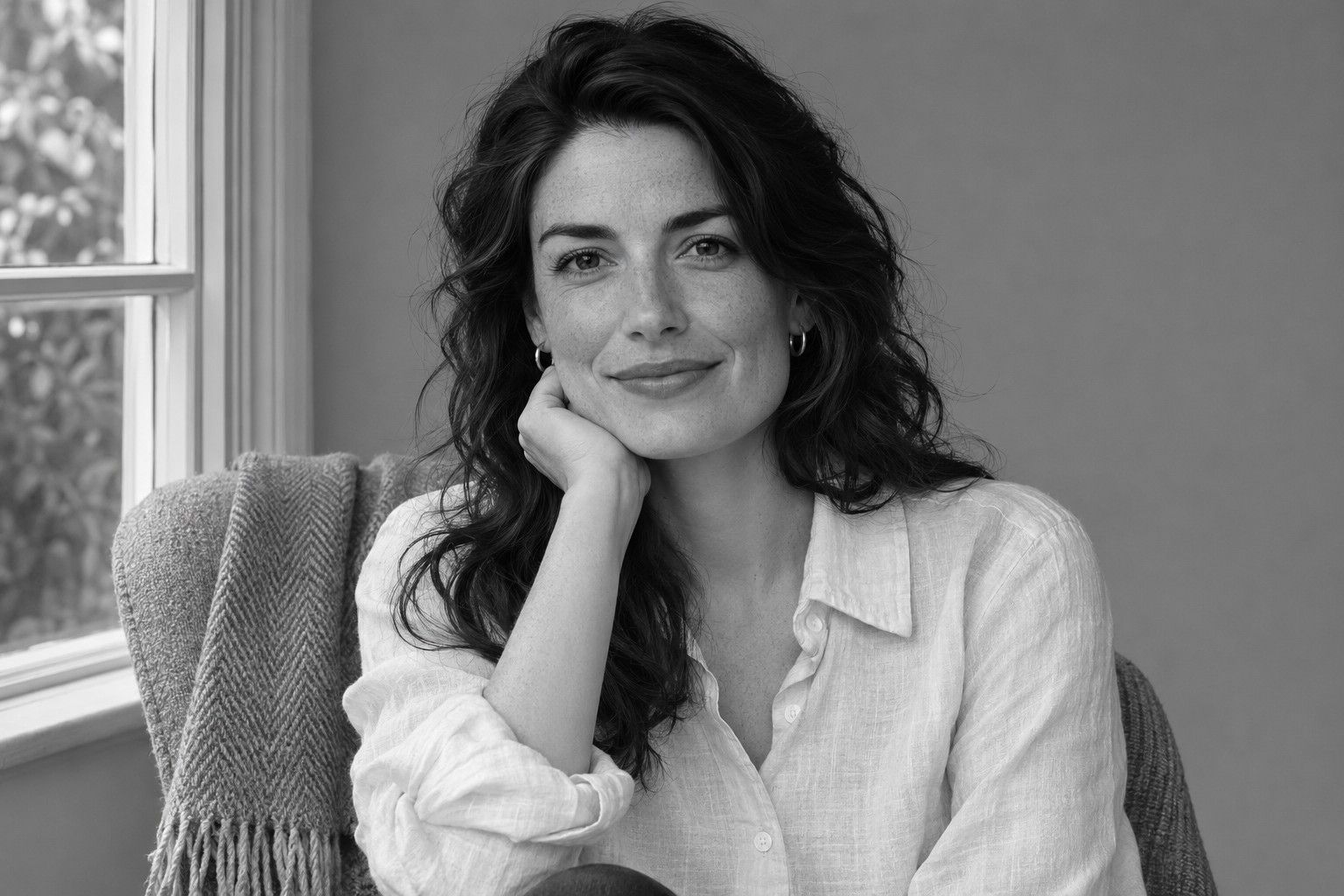
Keep the original colour image and make a greyscale copy in the same app. Where possible, lower saturation to zero in a duplicate and leave exposure, contrast and shadows unchanged. A dramatic monochrome filter can turn a light grey into white and a deep grey into black. Open the colour and greyscale copies side by side whenever a darker patch is hard to interpret. A patch of hair in shade is easier to recognise as a shadow when you can see where the light comes from in the original.
If you want a second photo with your hair tied back or your glasses removed, take it before moving the camera. Check whether the wall or other background has become lighter or darker between frames. A shift there suggests the exposure or light has changed, so compare features within each image before comparing the images with each other.
Compare feature values by area
Start with the larger visible areas. Look at the tone of your cheek away from highlights and compare it with the main body of your hair away from bright reflections. A large change from light to dark is one sign of a high contrast face. Similar values across those areas can give a low contrast face a gentle overall pattern. Skin and hair can both be deep or both be light. The amount of separation between the two matters more here than where either one falls on the scale.
Now look at the eyebrows, the iris when it is visible and the lips. Put more weight on features you actually see from a normal distance. Dark brows and lashes can create a clear frame even when skin and hair look close. In the reverse situation, dark hair and light skin may make a strong outline while the features inside that outline look softer. If you see two different patterns, record both. Each can help you decide how and where to use contrast.
One useful trick is to reduce the image to thumbnail size for a moment. Broad blocks of light and dark will still be visible and individual lashes or reflections will drop out. Open it again and pick one example of where the light-dark change is strongest. It might be the face against the hairline or it might be a dark brow against similar mid-tone skin and hair. The white of the eye and the darkest shadow under the chin are rarely helpful places to start, because each can produce an extreme value in an otherwise soft image.
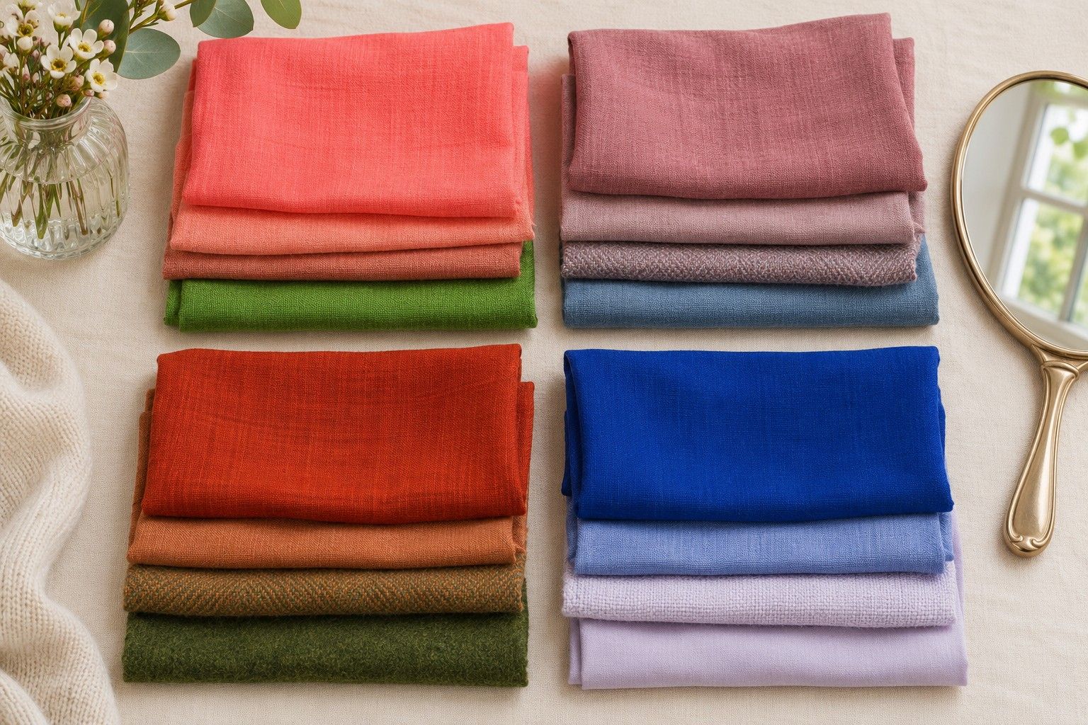
If you prefer a reference, set a small piece of mid-grey fabric next to the mirror before taking another photograph. You can use it to judge whether a large area appears lighter or darker under the same exposure. Avoid drawing a hard boundary using numbers from single pixels. The phone's exposure and the part of the cheek or hair you sample can move those values around. A broad visual difference across several areas is a more useful guide to dressing than a number tied to one image.
Translate contrast into outfit combinations
Build two necklines using a colour you already wear. If that colour is navy, try medium blue and navy together first, and then switch medium blue for pale blue. Use matte fabrics of similar weights where possible so the colour difference is easy to see. Try the same exercise with brown and cream or charcoal and grey. Compare yourself from a couple of steps back so you see the face and neckline together.
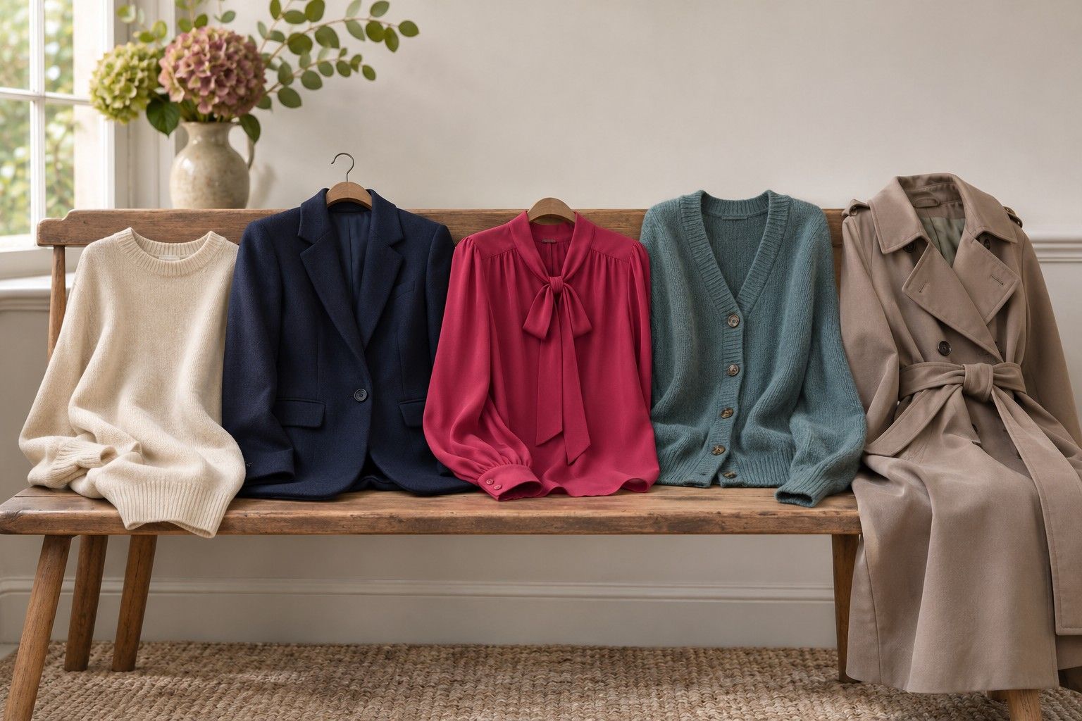
Where your face has broad differences between light and dark, a sharper pairing can echo the changes you already see. If a full pale shirt beneath a dark blazer feels strong, leave a strip of pale colour at the collar or try a thinner stripe. A small area of a light fabric makes a different outfit from a large block of it. If your features are closer in value, try grey-blue against slate, or soft cream against light taupe. Move the deepest shade away from your face and use it for trousers or shoes if you still want a clear break in the outfit.
A face with a soft overall outline and darker brows may suit an outfit with a gentle base and a few narrow dark details. Think of a plain light taupe top with a fine dark collar or thin charcoal frame. If your outline is dark against light skin and your features inside it look quieter, try the reverse approach. A dark jacket can carry the broad separation while a softer colour sits directly at the neckline. Take a mirror photo of each choice and compare the amount of light and dark you see before you decide which feels easier.
The photo helps with lightness combinations. Use the original colour image and the mirror for decisions about temperature and saturation. Olive and burgundy of the same depth might be easy to tell apart in daylight while they look nearly identical in greyscale. Seasonal colour analysis deals with both kinds of relationships. A personal colour palette is easier to use when you can choose hues you like and adjust the amount of contrast between them separately.
Check tricky results with fabric
Hair colour and styling can change the size of the dark or light area beside your face. With highlighted hair, compare a photo with your hair loose against one with it loosely tied back. If the highlights are concentrated around the face, keep some of those pieces visible in an extra shot. Repeat with the glasses you normally wear if the frames are part of your everyday look. Dark frames can give a stronger contrast point than your brows do without glasses.
For a reading that changes in different photos, test the clothes directly. Take three pairs with the same darker top and different lighter layers. Move from charcoal and medium grey to charcoal and light grey to charcoal and off-white. Observe how much of each lighter fabric is showing, and keep it roughly the same across the three trials. If today's result still feels close, go through the same three combinations in the light where you normally dress. A middle pairing you like in both settings gives you a starting point.
Write the result as an outfit instruction you can use. ‘Charcoal with mid-grey near the face, white as a thin edge’ tells you more about your clothes than ‘medium contrast’ on its own. A second useful note could be ‘soft coat and bright scarf for a sharper look when I want it’. Keep the versions you would wear to different places. The contrast test gives you a way to reproduce them with other shades you already own.