A dark coat can feel right even when you are unsure whether your colours belong to Deep Winter or Deep Autumn. Both palettes leave plenty of room for depth. The useful distinction is what happens when you change the warmth or clarity of a dark colour while keeping it about as dark as the one you already wear.
Start from shared depth
A Deep Winter colour palette often brings cool berry, ink and deep jewel colours together. Deep Autumn tends to have more warm brown, russet and softened dark green. Those descriptions are tendencies. Look at an actual coat or scarf and you will find dark teal that either wardrobe could use, as well as dark reds that clearly belong on different sides of a comparison. Dark Winter and Dark Autumn are other names you may see for these neighbouring palettes.
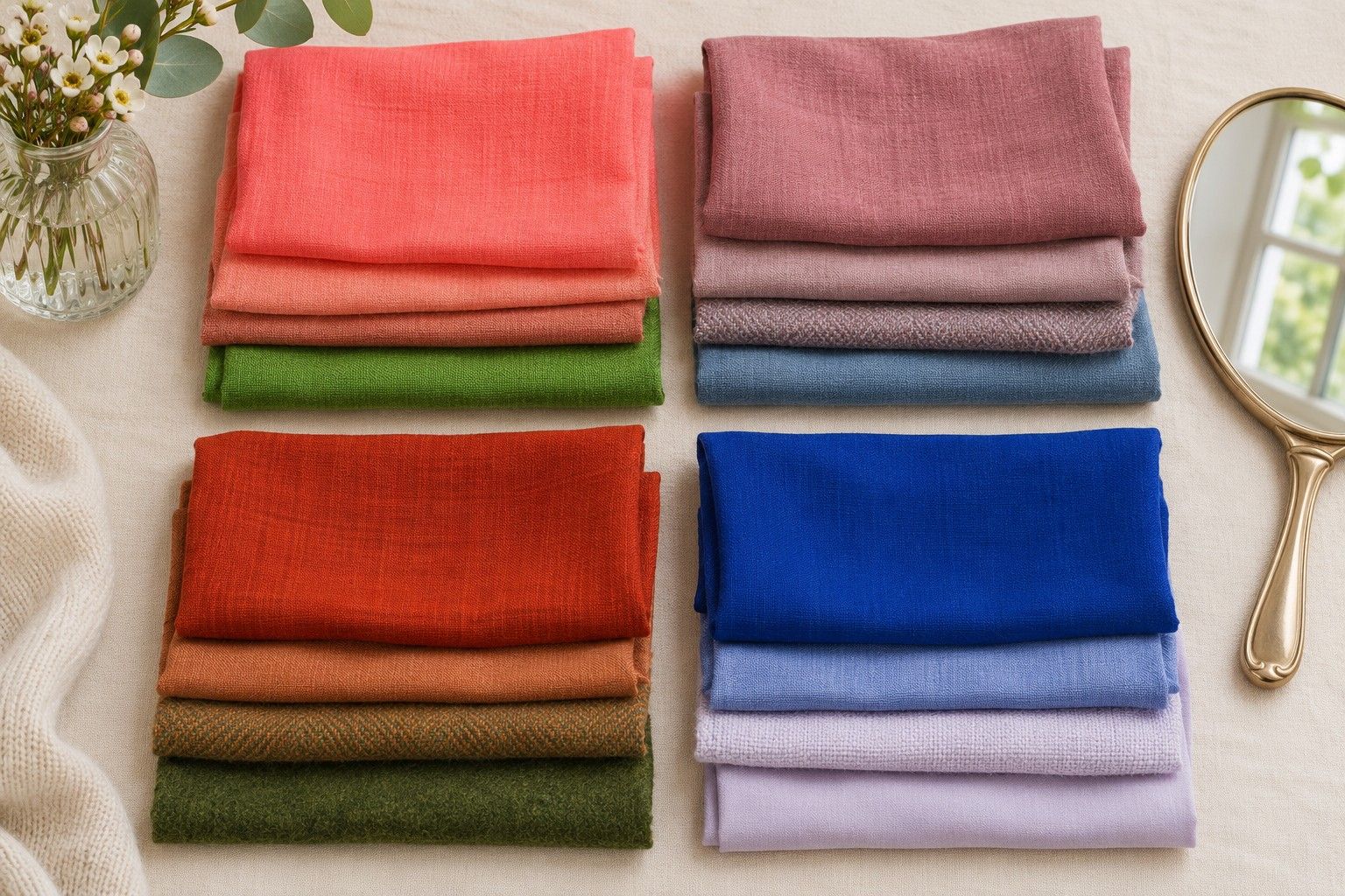
Test the shared preference for depth first. Take a medium navy and a much darker navy with similar undertones. Use a plain piece of each, out of direct sunlight, with the cloth held under your chin. If the darker navy frames your features comfortably, check whether a darker green or brown does the same in a second pair. A shift from cobalt to dark petrol would also change hue, clarity and warmth, so choosing fabrics in the same colour family makes this easier to read.
Take note if the darks you like seem slightly softer up close. A faded black tee, for example, may feel easier to wear than a sharp, newly dyed black one. A wool coat can look gentler than the same colour in glossy leather. The preference for dark colours can survive the change in finish. Use it to set the depth of your next comparison, and bring the clarity difference into its own test.
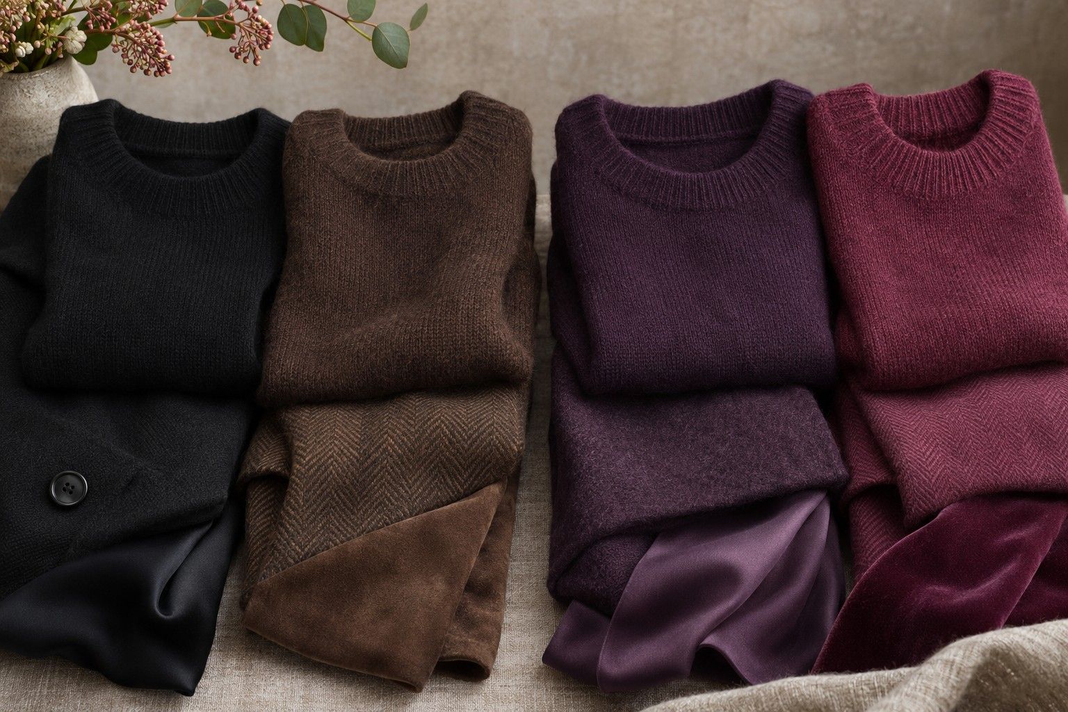
In dark fabrics, there can be more variation in reflection than you expect. Velvet will look lighter along the nap as you turn it, fine knits may show the shirt beneath them, and fleece will have a fuzzier edge than tightly woven cotton. A pair with similar finishes lets you see the colour difference more clearly. Check that you can see each cloth distinctly in daylight before trying to judge how it looks next to your face.
Compare plum and aubergine
Shop labels tend to use plum and aubergine loosely. Look for one dark violet that reads more blue or berry and one that reads slightly brown or red. Set them out on a grey sheet of paper. The warmer sample may look more like the skin of a dark purple fig, while the cooler one can have the cast of a blackberry. Both should be deep enough that the first difference you notice is in the cast of the colour.
Alternate the two close to the face and record a specific observation. The berry can put more emphasis on the pinks around the nose or pull the focus towards the lips. A warm aubergine may sit well with the colour in your hair, or look slightly flat alongside it. If the only difference seems to be how dark your chin shadow looks, move away from overhead lighting and check again. Aim for even illumination across the face.
Run a second comparison with green. An inky blue-green against a slightly warmer forest or deep olive makes the result less dependent on what you think about purple. Teal versus olive can be too broad a jump in some fabrics. If one piece glows and the other has been washed for years, try a darker pine green with less of a blue cast as the warm-leaning side of the pair. The closer the colours are in strength, the more useful the shift in temperature will be.
If cooler plum and warmer green both appeal to you, there is no need to declare one a mistake. Check them at the scale you intend to wear. Sometimes a deep violet feels good in a wide scarf and the greener shade works better across a small collar or on a bag. Keep both if they fill different roles. You can compare a cool and warm neutral next to decide where you want the greatest flexibility.
Check black against brown
Compare a matte black to a very deep brown that has a little warmth. Espresso can read almost black indoors, so look at both on a table in daylight before you bring them to the mirror. Pick the one that still shows a hint of brown in a fold or along a shoulder. An ordinary milk chocolate can be too light for this job, especially when the black is very saturated.
On the first pass, compare both without jewellery or a bright shirt showing above the fabric. On the second, let the same small edge of a light top show under each. A white tee can make the black look more graphic, and a warm cream can give the espresso a softer connection. One test with the same top controls the comparison. A further test with a different light shade each time may tell you more about how you will wear the coat in practice.
People between Deep Winter and Deep Autumn sometimes settle more readily on charcoal, ink or blackened brown than on the two extremes. If both extremes feel demanding near the face, see whether a smoky charcoal has the depth you like with a gentler edge. If both look fine, use accents to break the tie. Deep raspberry with black and muted rust with brown make two different wardrobes around pieces that occupy almost the same amount of visual space.
Try setting the stronger cool or warm shade away from your face as well. Look at black trousers with warm burgundy knitwear, then a dark brown skirt with a cooler blue. A slight temperature shift can be easier to use when a different colour forms the neckline. Set aside anything that seems especially different indoors and by the window, and judge it under the light in which you normally wear it.
Choose outerwear and accessories
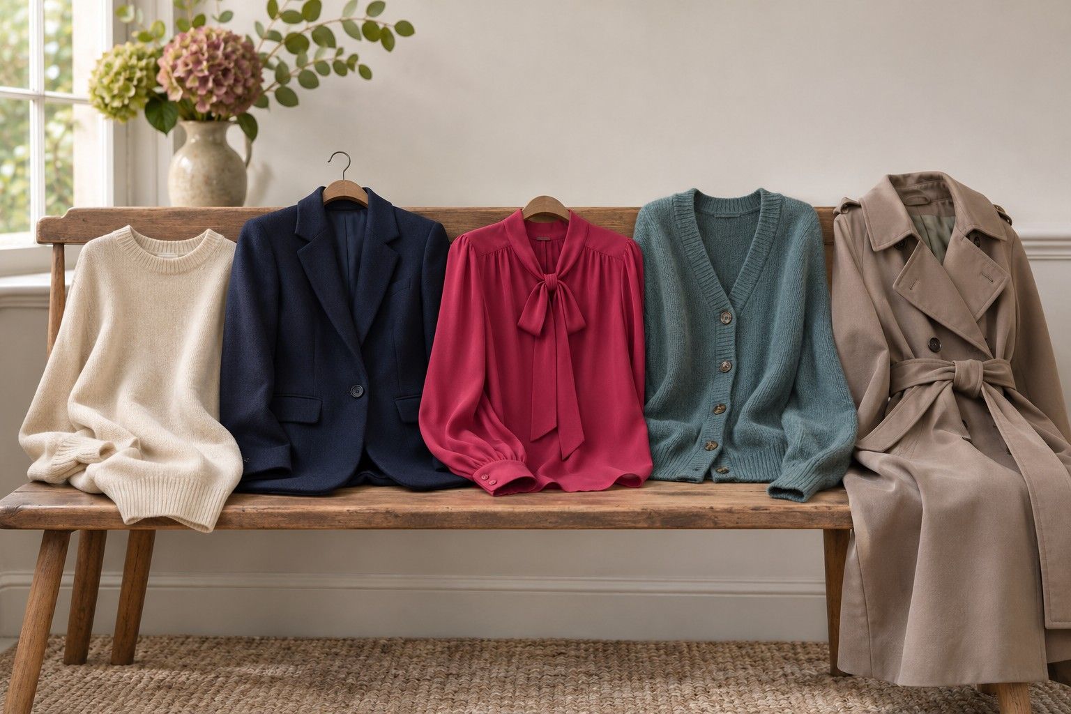
A coat is a good place to apply the result because so much cloth is visible and the collar comes close to the jaw. Look at the coat fully fastened, then again with the front open. Worn over a dark jumper, the collar may look like part of one continuous shape. Over white or warm ivory, the dark coat makes a clear outline. Decide how often you will wear it each way before you pick the darkest or warmest option.
If you like the cool shades in the tests, try a dark ink coat with a blackberry scarf or a relatively clear blue. If the warm shades worked well, compare deep brown with olive, clay or warm burgundy. In a shop, bring along a scarf or top you already own. A colour chart is useful for finding a likely rail of clothes, and a familiar bit of fabric lets you check whether the new garment can join what you already wear.
For accessories, check the visible finish as well as the colour. A shiny chocolate bag can pick up gold light that a matte espresso coat barely reflects. Brushed hardware is a milder change than a polished buckle. If a bag seems too warm for a cool outfit, see whether the coat and shoes give it enough company or whether you would keep reaching for a different bag. Small accents generally leave more room to mix the palettes than a full-width collar does.
Set a few samples aside from the tests that produced the clearest results. One shared dark neutral and one clear preference between a warm and cool accent are enough for the next purchase. If the dark green only worked in your test because of its finish, write that down too. The most useful version of either deep palette is specific enough to recognise when you see the cloth in a shop.